Wastefulness is Negligence

Welcome to Wasteland, Besser Space Collingwood.

The ideas of a Wasteland have been derived from the Latin meaning of waste which is uncultivated/unoccupied[1]. The bases of the manifesto for the exhibition ‘Welcome to Wasteland’ is an explanation of these original meanings. With focus upon land and waste the exhibition holds products and art created from products of waste. Industrial designers, graphic designers and architects were asked to create a product out of waste for the exhibition. All together 32 designers across various disciplines participated and contributed to the final exhibit. Hosted in Besser Space in Collingwood the works were displayed as part of Melbourne Design Week provoking thought into our production of waste and the transformation of it.

Exploration of the use of waste materials exhibited is vast ranging from pigs blood to coffee grounds, to materials such as wood and marble. Insight was provided as to how leading practitioners are approaching the Australian waste issue. The question arises as to the responsibility of designers when regarding issues of waste and sustainability. The manifesto for Wasteland states that ‘the act of making wasteful products is negligence’[2]. The statement is direct and clear calling on designers to be able to sustain their field. By not designing sustainably does the result still classify itself as good design? Is it okay to not consider the implications of designs produced or is that as stated negligence? By making ethical design practices known to industry we may then explore the results of good design at the heart of production.

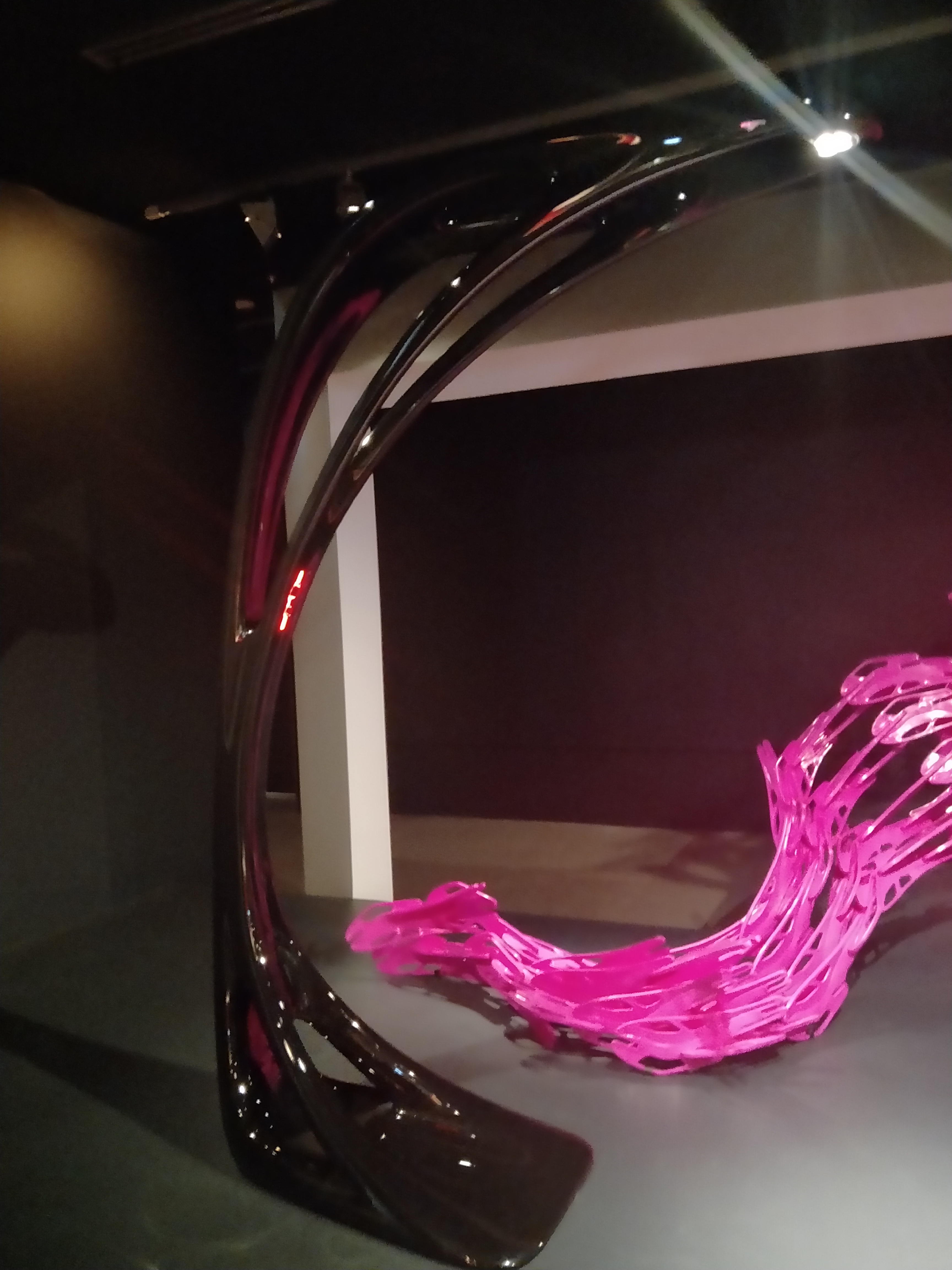
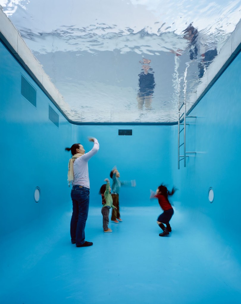
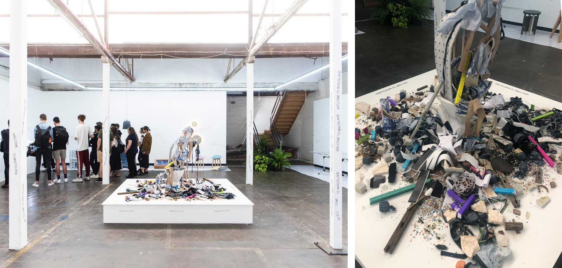
In the centre of the exhibition, on a pedestal, stood the collection of waste produced from the designers during production of the objects for the exhibition. This centre piece statement reiterates that waste is at the heart of the exhibition[3]. The placement of the waste is seen growing up from the toilet in the centre and also spreading around the base. The choice of displaying the waste objects in this manner instead of an organised one also demonstrates the carelessness for discarded waste. Materials of all sorts were included and only sharp knifes or tools were omitted for safety purposes. The collection in the centre also speaks as to the amount of waste that is produced. It provokes thinking as to what the centre would look like for waste beyond the production of only 32 objects.

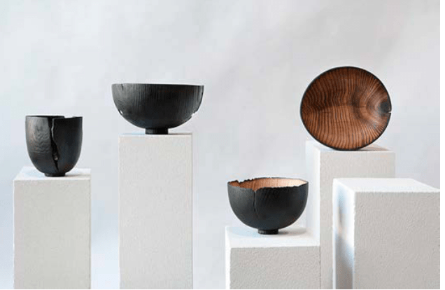
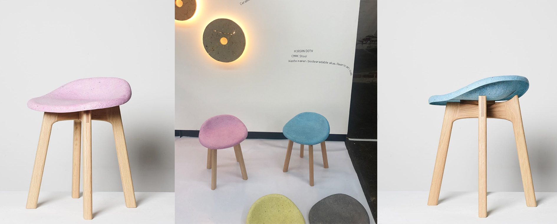
Designer Morgan Doty contributed to the exhibition with her CMYK Stools. The 4 stools were created out of waste paper, biodegradable glue and American oak. The stools explore the concept of paper being given a more permanent use as furniture. The use of paper is short lived as someone may write something down then throw the page away instantly. This contrasts to the form of furniture which is an object that is used repeatedly over a longer life span. The shredded paper pulp was moulded and combined with digital fabrication techniques to achieve the shell structure of the top of the furniture stool. The stools act as a physical manifestation of printing with each stool representing the ink based colours CMYK (cyan, magenta, yellow and key). The materiality of the stool is stated with the textured surface displaying fragments of text from the waste paper. The rawness of materials impacts the design and makes each stool unique even though they are all uniform. Designing with a message and purpose is seen in this work with a sustainable re use of waste material. Morgan states that ‘each tonne of paper recycled saves 13 trees, 331,780 litres of water, 2.9 tonnes of CO2 emissions and 4 cubic meters of landfill’[4]. This large impact communicated places the stools in perspective and re affirms the impact of recycling.

Critiquing whether the design presented is classified as good design comes from the intention of the designer. Good design is seen to be acknowledged by colleagues as being creative, imaginative, skilful and having a certain depth in thought and intention[5]. Even as the materials used are classified as waste, the re-production with purpose and meaning brings the waste into a new life. Good design and good taste are often used interchangeably although the concepts of each vary. The thought and intention of the recycled waste as products may be seen as good design but does that result in it being tasteful design. Is a pile of waste in an exhibition considered design and of good taste? In analysing what is considered good taste it is found that taste is socially constructed. Therefore, it speaks of the systems and processes people create as the criteria for determining what is considered as good taste[6]. As a society the wastefulness and negative impacts of mass consumption are on a grand scale. By coming to terms with wastefulness and by not neglecting our impact this could socially construct a new criterion of what is considered to be of good taste.

The exhibition Wasteland in my opinion is of good taste and design as it generates meaning for users and viewers of the works. The intentions of each of the 32 designers work towards the overarching concept to not be negligent when it comes to waste. Products produced provided opportunities for the discarded functional objects to exist beyond their intended destination of disposal and landfill. Not only were the creation of these objects sustainable but the production and display of the exhibition also adopted sustainable processes. Examples of this include the solar powered web server which runs the website for the exhibit. Another example is seen as the text on the exhibit walls were done using a hand-held gun as an alternative to printing on large rolls of paper. All elements of the exhibition create a sense of awareness and call on designers to take an un wasteful approach.


[1] Friends and Associates, “Welcome to Wasteland,” Wasteland, accessed April 7 2019, http://solar.friendsand.associates/

[2] Ibid

[3] Friends and Associates, “friends.associates,”, accessed April 7 2019, https://www.instagram.com/friends.associates/

[4]Friends and Associates, “Morgan Doty CMYK Stool,” Wasteland, accessed April 7 2019, http://solar.friendsand.associates/waste-paper-biodegradable-glue-american-oak

[5] Despina Christoforidou, Elin Olander and Anders Warell, “Good Taste vs. Good Design: A Tug of War in the Light of Bling,” The Design Journal 15, no. 2 (2012): 187-191.

[6] Ibid

Women in industrial design

Industrial design is still dominated by men in the design field today, although feminism is growing. There is data showing that the proportion of women in industrial design is much less than that in graphic design. Of course, the situation has improved in recent years, and the number of women in industrial design has increased. The low number of female industrial designers is due to discrimination against women in both education and at work. Female industrial designers have limited job opportunities after graduation, and employers believe that women are not suitable for the industry, resulting in fewer women choosing to study industrial design [1]. Women just need a chance to be recognized and treated equally. The society should try to recognize female designers and look at the work with a fair attitude, not by the gender of the designer. Women have the right to pursue design freedom. Women should not be limited to specific designs. They should not unilaterally think that women are not suitable for technological industrial design, only suitable for graphic design with a more artistic atmosphere. Technology does not only belong to men. Women’s ability in industrial design cannot ignore. Female designers, like male designers, have the ability to make good works, and they are also suitable for industrial design, even better than male designers. The female designer’s work highlights the elegance and gentleness of women, both in form and colour, and shows women’s unique visual thinking and creativity. These are not available in male designs. Women are not only suitable for families. Believe that women can balance family and work well, and becoming a mother also gives women designers a new life experience. After all, the design comes from life, these may not be a disadvantage but an advantage. Women have some aptitude for aspects of industrial design, especially the skills of ‘styling’, ‘colour’ and ‘appreciation of the end-user’ [1].

Figure 1. The photo is from myself. (2019). Genesy lamp

Nowadays, many female designers use superb design to the voice of feminism to arouse people’s attention to gender equality and feminism. Zaha Hadid is a British architect from Iraq. She was the first female architect to be awarded the illustrious Pritzker Architecture Prize. She reaffirmed the role of female architects through bold design [2]. In her process of achieving super high achievements, there have been many doubts, but she has proved her ability through her specialties. While she has achieved outstanding results in architectural design, she has also created many industrial design works. The Genesy lamp was designed by Zaha for Artemide. It has complex geometries and structures. It is Zaha’s exploration and research on the growth system in the natural world. The lamp is like a growing tree, and the trunks are connected to each other to form a canopy. The main component of this organic analogy changed from an abstract diagram to a fluid design of Genesy. The Genesy lamp embodies the symbiotic relationship between the sensual flow of the natural world and the exacting tolerances made possible by state-of-the-art manufacturing technologies, which combines natural growth with technological creation [3]. This lamp is Zaha’s research on the new design method. Through creative ideas, she breaks the routine and brings a new look to people. She uses her work to embody the importance of female design researchers, and women have good technology. Zaha encourages other women as a female role model, she believes that every woman is gifted [4]. She encourages women to dare to innovate and dare to pursue their own ideas.

Through Zaha’s work, we can see those female designers can also do well. Women play a huge role and influence in design, but most of their work is not recognized by society. We should not let traditional values become a barrier to women’s careers in Society design. Society should change people’s subjective thinking, abandon the old impression, re-recognize the women who are making progress, see the influence and role of women in the professional society [1]. The society also should try to cooperate with female industrial designers, and give At the same time. Female designers should strive for their own actual conditions, recognize their own strengths and weaknesses, enlarge their own advantages. Female designers also should continue to learn, and constantly improve themselves. All of these things will help them increase the value in their work. Through their own strength, women will let society see their ability, show their professionalism to reduce prejudice and improve their position in the field of industrial design. Although inequality may not disappear at once, and there are still many challenges to face, everyone should work hard to reduce the gap between men and women designers. I hope that In the future, in industrial design, we will strive to achieve equal treatment for male and female designers, provide women designers with a better design environment and more opportunities, and let more and more women enter the field as excellent designers. Designers industrial design, the industrial design field will become more diverse.

  1. Christoforidou, D., Olander, E., Warell, A., & Holm, L. S. (2012). Good taste vs. good design: A tug of war in the light of bling. The Design Journal15(2), 185-202. Retrieved from https://lms.monash.edu/pluginfile.php/8323619/mod_resource/content/4/Wk%202%20Despina%20Christoforidou%2C%20Good%20Taste%20vs%20Good%20Design%20%281%29.pdf
  2. Anna, A. (2018). Zaha Hadid and the female empowerment of architecture in Europe. Retrieved from http://heritagetimes.eu/zaha-hadid-female-europe/
  3. Zaha Hadid Architects. (n.d.). GENESY LAMP FOR ARTEMIDE. Retrieved from https://archello.com/product/genesy-lamp-for-artemide#product-description
  4. VOGUE. (2016). Zaha Hadid’s most memorable and inspiring quotes. Retrieved from https://www.vogue.com.au/vogue-living/design/zaha-hadids-most-memorable-and-inspiring-quotes/image-gallery/b92978d33fc292acc66edd1945b2d1bc?pos=1

Designing Women: Christian Dior 2018 S/S Look48

From ancient times to the present, the problem of the inequality between men and women has always been questioned by people, that how does this happen and what can we do to solve the problem? Until nowadays, the invisible ceiling is still existing, so what we can do to fade this situation is discussing how to make women’s talent can be seen by the world? How do women express their design thinking and be recognized? 

“Designing Women”, is a limited period exhibition focused on art pieces designed by female designers at National Gallery of Victoria during 2019 Melbourne Design Week. We can easily explore and find the differences between male and female designers, especially on clothing, female designers express more about woman power and their true egos, that we can not see in male designers’ artworks. Spanning nearly 40 years, from 1980 to 2018, Designing Women highlights the ongoing role of female designers as a dynamic and critical force in shaping contemporary design culture. From fashion design, contemporary jewellery, and product design, to architecture and digital innovation, Designing Women draws from the NGV Collection to showcase over 50 significant works of design – across diverse creative fields – all united by their female authorship[1]. 

Maria Grazia Chiuri, who is the first female creative director of Christian Dior announced in 2016. Before joining the  Christian Dior group, Chiuri has worked for Valentino from 1999 to 2016. She shows her talent, and different design thinkings very well, because she understands how to express and combine her idea with traditional design languages of various brands, such as Valentino and Christian Dior. She proves that gender is not a matter in fashion design, and she still put much effort to express that female designer can do the same thing that male designer can do, and female designer can also be the leader in great company or brand. One of her design , “Look 48 Dior 2018 spring-summer”, has been exhibited in the exhibition.

Throw back to the history of fashion design, the proportion of male and female couturier is imbalanced until now, due to many issues and gender politic in the past, which is still influencing most industries include fashion industry, with men disproportionately dominating top roles across all areas of business.

Of the 371 designers helming the 313 brands surveyed by BoF across the four fashion weeks, only 40.2 percent are female. This gender imbalance is not equally weighted across the different cities either. New York and London, where the fashion week schedule skews to younger, more emerging brands, have the highest proportion of female designers, with women accounting for 47.3 percent and 40.5 percent of designers respectively [2]. It can be regards as like gender marginalization, so we should not define people’s talent and position by gender, and other unequal rules. Until now, the inequality of male and female is still the fact, so female has to put more effort to express their creative and different design thinking, especially in the fashion design. 

Except gender issue, what cause this effect? There is other group of people discussed that, the reason why male designer can be famous and respected by people is that male designer is using their imagination of the ideal woman, such as goddess and Venus. This thinking of that male couturier can make better pieces is already inveterate to everyone, even there is another female couturier that can do the same thing.

Marginality in this context is being on the edge or outside of the relations of exchange, no matter where they are located, on what scale they might be, or who or what is powering the activity[3]. Marginality is everywhere, and if you are not on the trend or not belong to the main group in the world, then it is very hard to survive and be seen by public, no matter in what field. Chiuri broke the marginality of gender in fashion design since she is aware of the globalization and the contemporary social expectation, she attempts to distinguish herself from the main stream of fashion industry by making her voice widely heard.

We can always see that she adds a lots of ingenuity to express the beauty and tenderness of femme in her design which we can not see from other male couturiers’ designs, not only from her designs at Dior, but also from the most pieces she designed in the past. In the period of Valentino, she expressed the elegance of women by using floral elements and earth tone silk. She is good at playing around these colour and material. 

 For the 2018 spring–summer collection she reflected on Surrealism and the unconscious, with reference to the work of Leonor Fini, a female avant-garde artist who Christian Dior exhibited in the gallery he ran before becoming a couturier [4]. Look48, Chiuri used the combination of metal and silk, created a huge contradiction to express the style of avant-garde. The tactile and visual impression of metal and silk is totally different, but Chiuri transferred metal to a soft and comfortable material to wear. Also, we can see the middle part of the dress is most covered by metal, but it still perfectly present the line of the model.

Chiuri proved that women can lead a historical brand which have no female creative director before. She breaks the marginality of gender, leading a huge fashion group, and created her own style which can not replace by anyone. Although women still have to work harder to prove what they can do even better than men, but if you got talent, and creativity, gender will not be a matter to stop you to move on the road of success.

[1]National Gallery of Victoria: Designing Women. Accessed March 30 2019 https://www.ngv.vic.gov.au/exhibition/designing-women/

[2]Helena Pike,Female Fashion Designers Are Still in the Minority. Accessed March 30 2019 https://www.businessoffashion.com/community/voices/discussions/how-can-fashion-develop-more-women-leaders/less-female-fashion-designers-more-male-designers

[3]Tony Fry, A Geography of Power: Design History and Marginality

[4] ]Labels of Designing Women. https://www.ngv.vic.gov.au/wp-content/uploads/2018/10/Designing-Women_Large-print-labels.pdf

Good design and value

There is a social phenomenon in today, that is, some people think that only expensive things have a good design. In my opinion, no matter how expensive or inexpensive the product is, people should pay more attention to the value behind the design and whether it is practical. Good design needs to be valuable and practical, and price cannot use as a measure of design.  Norman said before that good design must have content, imagination, and creativity, and thought and intention of the idea has a certain depth [1].

Figure 1. People’s Daily. (2018). Palace Museum launches exquisite original lipsticks.

The Palace Museum is the largest museum in China, an ancient building complex that records the history of Chinese and preserves historical artifacts. The cultural and creative products of The Palace Museum have attracted a lot of attention in recent years. Designers use their professional knowledge to start from everyday products, using the artifacts in The Palace Museum as a source of elements in the design, and adding fashion elements to the traditional culture. Through this innovative design that combines the new and the old, the tradition and the modern, the designers convey the traditional Chinese culture to the public and make the cultural heritage of The Palace Museum vivid. Last year, The Palace Museum released six colours lipsticks. These lipsticks have Chinese characteristics in both lipstick colours and lipstick packages. The exquisite patterns on the packaging, lipstick colours and design inspiration are all come from the artifacts in The Palace Museum, and they all have a good meaning [2]. The different kinds of flowers and animals on the outer packaging are all showing Chinese culture. As a Chinese-style cosmetics, their unique packaging attracts many young girls, and they are very popular with young girls. Through these cultural and creative products of The Palace Museum, young girls feel the charm of traditional culture, start to pay attention to the history of China, and want to know more stories behind the design. There are also many people who have been interested in the cultural experience of The Palace Museum because of these cultural and creative products and went to The Palace Museum to experience. Designers change person perceptions of traditional culture through design and bring a new way of inheriting traditional culture. The cultural and creative products make The Palace Museum closer to our life. The Palace Museum is no longer a cold, old and mysterious image. These changing many personal prejudices against the traditional museum. This is the positive significance of design to inheriting traditional culture, which fully reflects the cultural value of design.

Figure 2. The photo is from myself. (2019). Poetry cards

I have done a similar job before. I was born in Xi’an. It is a city with a long history and the starting point of the Silk Road. I have done a set of poetry cards about Xi’an, using paper-cut as a form of expression. I use a lot of traditional elements of Xi’an in it, such as Xi’an poetry, scenery, food, and traditional patterns. Through the words and Illustrations printed on the paper, combined with modern expression techniques, the feelings brought to me by Xi’an and the traditional features of Xi’an are conveying to the public. I hope that through poetry cards, they can attract more people to pay attention to Xi’an and can break the old concept bias that Xi’an is backward. By design, people can see the historical imprint that Xi’an has retained today, see the cultural heritage of Xi’an, see Xi’an’s current development and strength, and see the attractive places in Xi’an. I hope that my design can use its maximum value allows more people to re-recognize Xi’an and like the city.

Whether it is The cultural and creative products of The Palace Museum or my work, we use the combination of tradition and modernity to spread the traditional culture in the form that young people like, and hope to get more attention from young people and play the cultural value of the design to the maximum. We hope that young people nowadays will not forget the past, pay more attention to the cultural history of China, and inherit and carry forward the traditional Chinese culture. This is the value that design can bring. In my opinion, good design needs to be valuable. Even though some designs still be flawed, but I believe that in the future, through the efforts of designers, the design will continue to be improved and have higher quality.

  1. Bruce, M., & Lewis, J. (1990). Women designers—is there a gender trap?. Design Studies11(2), 114-120. Retrieved from https://lms.monash.edu/pluginfile.php/8323633/mod_resource/content/1/wk%209%20bruce%20and%20lewis%20women%20designers%202.pdf
  2. People’s Daily. (2018). Palace Museum launches exquisite original lipsticks. Retrieved from http://en.people.cn/n3/2018/1212/c90000-9527920.html

Female Images in Advertising

Throughout the history of advertising, the female image has changed along with time. At first, the female image in advertising was humdrum with sexism, such as sexual fantasies or stereotypes of the good wife and good mother. But at present, we can find numerous powerful and independent female images in advertising. The struggle between Nike and its advertising agency Wieden + Kennedy (W+K) is representative this historical narrative.

Nike was known as a masculine sport brand. The parent brand depicted the image of sweating, muscular male athletes. In 1990, Nike executives laughed the women sub-brand. Actually, women’s professional sports were non-existent at that time. The sub-brand opened the door to the huge female market. Almost all advertisements for the Nike Women’s sub-brand were created by the female creative team from W+K between 1990 and 1997. During the early 1990s, the female stance was barely reflected in advertising. To expand the market, Nike executives and the female creative team had totally different ideas about how to achieve this. The team tried to challenge female stereotypes and the social construction of gender through their ads. [1]

In 1990, Nike Women’s first campaign was named List(Figure 1). The creative team started with criticism of women’s magazines. They found that magazines could not represent the actual lives of women. Moreover, members of the creative team were also women who were sick of the message that the magazine conveyed that women exercised for beauty. They believed that women exercise because it makes them feel better. Therefore, they printed a list of what women should refuse. Their audience responded with enthusiasm by hanging the list at home, showing it to their daughters, and buying Nike instead of other brands. [2]

Figure 1

Although sales increased, Nike didn’t acknowledge their efforts. Nike Men got large budgets but Nike Women didn’t. Also, they were restricted to several pages of ad space. Furthermore, Nike executives required that the models in Nike Women’s ads be pretty. Janet Champ, a member of the creative team, wrote a sixteen page ad that was cut to eight pages in the end. This campaign, named Empathy(Figure 2 – Figure 4), described women’s experiences from their childhood to adulthood. The creative team encouraged women to be independent and live for themselves like the sentence in the ad: “never too late to have a life and never too late to change one.” [3]

From 1991 to 1992, the Dialogue (Figure 5) campaign was launched. The idea for the ads came from the life experiences of ordinary women like the Listand Empathycampaigns. For this campaign, Champ used an old photograph of her sister and mother. As a woman, when she was growing up, she was expected to be soft and tolerant because of the stereotype of women in society. In this ad, she wrote that “you are not destined to become the women who came before you… the only person you are destined to become is the person you decide to be.” She asked the audience to be the person they want to be and challenge stereotypes of women. [4]

Figure 5

In 1994, at spring, the creative team advised Nike to add sports and not just fitness. But this was hard to realize. The Nike parent brand rejected being “pinkified” by the women’s sub-brand. And those man of Nike executives didn’t believe women can do real sports. Female seems another species for them. In the fall of that year, the campaign shifted from fitness to real sports with Just Do It Stories(Figure 6 – Figure 7). For this campaign, they launched three ads. Two of them told the experiences of two female athletes – Jackie Joyner-Kersee and Mia Hamm. The other one was based on the experiences of two lesbians. The creative team used the lesbian elements to protest against hegemonism. [5]

All of the above campaigns got enthusiastic responses from audience as well as increased sales. The creative team create a sense of empathy with the audience and remind them of past experience. Like the female creative team at W+K, I created a poster as a voice for women (Figure 8). It started from a situation in China where women over 30 years old are often pressured to marry. Those women are called “leftover ladies” or “leftover women.” In Chinese society, most people think an unmarried woman is incomplete and that a woman should be a good wife and good mother. Therefore, once a woman becomes a leftover lady, the people around her, such as her parents, grandparents, and colleagues, desire to see her get married. In the poster, I used only black and white to form a strong contrast. The black square implies the pressure from people and society. The fist represents the power of these leftover women. The women break away from that pressure of getting married so that they can make the decision for themselves of whether to get married or not, decide who they are, and what is meaningful. Same as what the creative team for Nike Women did, the idea of the poster came from the life experiences of ordinary women to create a sense of empathy with the audience. The tagline, “Decide for yourself,” encourages leftover ladies to be independent. All the work by W+K and me are to provide a voice for women and empower women to be confident, independent, and to live for themselves. Moreover, we both question the social structure and protest against the stereotypes of women as well as the patriarchal oppression of women in society.

Figure 8

At the beginning of this story, Nike executives restricted the Nike Women’s creative team to a small budget, pretty models, fitness, and soft female image. Through the struggles of the team, they used ordinary women as models, and started to focus on real sports, showing portrayals of powerful and strong female athletes. Pierre Bourdie conceived a term, “symbolic violence,” to refer to cultural expulsions that might be imperceptible forms of class distinctions. [6] Symbolic violence reflects various aspects in the design industry. One of them is the stereotype that women should be pretty, soft, emotional, and are expected to be good wives or mothers in advertising. Fortunately, there are many designers like the creative team at W+K, who speak for victims, question conventions, and protest against the patriarchal society through their designs.

[1]Grow, Jean M. 2010. The Gender of Branding: Early Nike Women’s Advertising as a Feminist Antenarrative.

[2] Ibid

[3] Ibid 

[4] Ibid

[5] Ibid

[6] Onafuwa, Dimeji. 2018. Allies and Decoloniality: A Review of the Intersectional Perspectives on Design, Politics, and Power Symposium.

Designing Women – Makiko Ryujin

“Designing Women is an exhibition that highlighted the dynamic and critical force of female designers in shaping contemporary design culture” (Kalms, 2019). In other words, all designers whoes work been exhibited are talented women. The exhibition has been divided into four themes, Leadership; Community; Teamwork and Research.

One of the initial and major ideas of Designing Women is to point out the issue of sexual division of labour and to show the gifts of women designers. “The design industry itself, then, perpetuates the passive female stereotypes — women designers do sedentary work on textiles, fashion and ‘pretty picture’ (graphics), while the men do the ’rougher’ ‘more practical’ work of designing consumer and industrial products” (Bruce & Lewis, 1990). If you look at the famous designers, they are usually male. Even in the clothing industry now, many design directors are male. For example, Alexander Wang and Virgil Aboh in Louis Vuitton who used to be a leader in Off White which is another famous fashion brand. In terms of industrial design, although there are more women in this industry than before, they are still mostly male designers take in charge the industry. Not to mention the Automotive industry. Noticing the issue of gender imbalance is just the start, understanding how gender difference can make impact on design is also a task.

Makiko Ryujin is a Japanese based designer who moved to Australia in 1999. Her work that be exhibited in the Designing Women is Shinki #3 which is a black and orange wooden bowl with various crack on the body. This bowl is not that attractive at the first sight. It is just a bowl that someone will even question its functionality due to the cracks. But when you start to look at it, you will notice that that bowl is made of wood with interesting rim which is similar to a burn wood piece. “Makiko Ryujin’s “Shinki Burning Vessels” represent a body of work that reflect on the transformation of timber by fire and captures the beauty of design processes that ca be at once about control and unpredictability” (Kalms, 2019). Indeed, she has a fine control on burning timbers without ruining the timbers. The grain of timber has been preserved on the appearance of Shinki #3, even though it was burned by fire. The wood that had been burned has a sense of looseness, as if it would crashes when people touched it. The inner wall of the bowl also has grain on it but different from the external wall, it has no rough texture. Some portion of the inner wall catches some burn as well which makes viewers focus on it, at the same time makes every single of the bowl unique. Because even the using the same timber, the various level of burn creates unpredictable outcome. The shape and the colour of the vessel is similar to a Japanese copper “Qing” which adds a sacred feeling. In addition, the inspiration of this burning series is based on Makiko’s personal experience that she visited a annual purification rites when she was little.

Japan has a tradition that people will buy Daruma and burin it few days after the Japanese New Year. People will first buy a red Daruma without eyes and draw a right eye on it first as they are making a wish for a new year. If their wish comes true, they will complete drawing the left eye and bring it to the rites and burn it. This action commonly is regarded as a exchange of luck. Makiko attended one of those ceremony and applied this idea to her burning vessels. After knowing the story behind it, I would like to say that the Burning Vessels can “bring” us luck while us using it. She has a website where we can buy another burning vessels from and use them as a container for fruit and etc. Actually, Japanese people will place one eye Darmua at home in a spot where they can see it easily, because doing that can remind the owners of their goals. Makiko’s design is beautiful and meaningful.

The Burning Vessels contains many aspects in terms of design. A attractive design inspiration with high techniques. In Makiko’s making process, she uses fire gun and dresses like a “man”, in comparison to the old image of a woman designer, Makiko is different. In the past, only men can make Daruma and host the rites. Within this kind of exhibition and theme, it’s hard not to think that Makiko is making a voice as women — Women can now do what men can do. While producing one vessels, she needs to make many attempts, so that it is possible to have a satisfying design.

Makiko is one of the designer that represents the Community part of the theme of the Designing Women. “Designer-makers contribute to the understanding of what design means, and central to designer-maker production is the passing on of tacit knowledge through communities of practice.” (NGV, 2019). The Burning Vessels a series of products that is regards as a everyday object contains the knowledge of Japanese culture and what Makiko wants to express as a designer-maker.

“Women have always been, and remain, a significant part of the design profession — as partitioners, commentators, educators and commissioners.”(Sellers, 2017) Although the imbalance will still remain in our society, the contribution of reducing it should to be appreciated. The division of labour is just one of the results of gender discrimination.

Images:

Figure 1: https://search-informit-com-au.ezproxy.lib.monash.edu.au/fullText;dn=220564185599900;res=IELHSS

Figure 2: https://images.app.goo.gl/Dd8ZeLKQrsGKcTj59

Figure 3: https://images.app.goo.gl/Mee6p3YQR4jR1DC5A

Figure 4: https://search-informit-com-au.ezproxy.lib.monash.edu.au/fullText;dn=220564185599900;res=IELHSS

References:

Kalms, Nicole. Designing women [online]. Artichoke, No. 66, March 2019: 118-121. Availability: https://search-informit-com-au.ezproxy.lib.monash.edu.au/documentSummary;dn=220564185599900;res=IELHSS ISSN: 1442-0953. [cited 08 Apr 19].

Bruce, M. & Lewis, J. (1990). Women designers: Is there a gender trap? Design Issues, 11(2), 114-120. https://doi.org/10.1016/0142-694X(90)90026-9

Forgotten Hero – Kazuyo Sejima

In today’s society, gender discrimination, racial discrimination and other unfair phenomenon are inevitable, however, design plays a vital role of shifting our subconscious. Designers produce works we use in our everyday life, such as small things like soap machine; the package of a toothpaste brand, etc. Good design makes people reevaluate themselves and bring people good influences. Whether by accident or on purpose, designers are changing the world. In contemporary time with imbalance ,there is a place where no matter how old you are and where you come from, you can find a comfort zone of your own here— 21st Century Museum of Contemporary Art.

Kazuyo Sejima is the second female winner of Pritzker prize which is the Nobel Prize in architecture industry after Zaha Hadid. Different from “the queen of curves”, Pritzker Prize jury described Sejima’s work is “Simultaneously delicate and powerful, precise and fluid” (Sellers, 2017). Sejima founded SANAA studio in 1987, which means Sejima And Nishizawa And Associates, the conjunctions are capitalised, emphasising that the connections uniting the people are as important as the people themselves (Sellers, 2017). She looks into human behaviour and combine her study 888 into her architectures.

People who visit the building can feel the idea of “uniting” in her design, as Sejima is trying to convey, “the gathering of people”. Generally, Sejima uses white as the main colour in her buildings, for example, the white ceiling, the white walls and white windows. The pure white covers the whole building which reminds us of a peaceful, relaxing and equal place. Inside the The 21st Century Museum of Contemporary Art, Sejima uses minimal material palette with limited details to depict a fluid spacial organisation. In an interview with Arch daily, the host asked about her understanding of white. She pointed out the white walls that surrounded her and said, “white is an ordinary colour, I try to make no hierarchy. That means also try to make free circulation, we try to bring light everywhere, try to make no big contrast, try to diffuses the light, I want to make people feel white” (Franco, 2016). Sejima hopes people from all over the world are allowed to feel that they are welcome. According to the reading Margin Design Studies (Onafuwa, 2018), “White Standard” which means western- dominant standard, are one of a fact that causes racial discrimination from the design of everyday products unconsciously. Thats why the author proposes that we should re-identify the meaning of “white”. Sejima has given “white” a new meaning here. There is no hierarchy in the space, there is no hierarchy among people here.

Since it brings people with different interests and different purposes together, Sejima quite likes the concept of parks and suggests that the public space is very interesting in terms of human interaction. Sejima tries to challenge the impression of traditional gallery which is cluttered with incomprehensible art works that gives visitors a sense of distance and consequently it’s difficult for people to enter. She challenges the relationship between arts and people. Museums that Sejima designed is like a park that everyone can join. “We began with the concept of an ‘open’ museum so that it is not only for experts but also for the people in the city, who do not necessarily have a professional connection with art,”(Franco, 2016) said Sejima. In the architectural aspect, the horizontality of the museum allows it with more accessibility. People are allowed to access the museum from any direction and flow inside. The floor plan of it matches the idea of welcoming everyone to gather or circulate inside. The concept of diffusing the differences among people, the non-hierarchy is really shown through Sejima’s design.

The 21st Century Museum of Contemporary Art in Kanazawa is an urban project which intentionally aims for marketing the city — Kanazawa, Japan. The museum is located in the centre of the Kanazawa. The shape of it is like a disc, which looks like a round cookie from a distance. Different from the traditional sense of majestic founder of the art museum, Sejima takes the circle as the primary shape of the design, also, the circle itself has a strong centripetal nature. People can engage in various outdoor activities around the circular building, forming a most primitive communication activity. In addition, the Japanese have a complex feeling to the “Circle” since ancient times, either the red sun in their national flag, or their worship of chrysanthemum, is showing that circle is special to Japanese people. Overall, the usage of shapes is simple but interesting. Sejima breaks the space into smaller spaces so that there is no specific wall that blocks visitors inside the museum. Those cubic rooms on the top are divided into different exhibition rooms, which give curators and visitors more freedom to interact with. As for the visitors, they will have their own choices on moving route inside the museum.

There is a strong feature in SANAA’s works — lightness. Her works are always about perception and feeling. They are clever on using materials and exploring various techniques. Therefore, their works are very penetrating and reflective. In Sejima’s works people will find that there are various levels of transparent material, in other words, a large amount of glass are applied to the interior structural pillars start to emerge into the space with them hidden to the corner by designers purposely. Sejima blurs the internal and external space of the museum, making them a kind of ambiguous relationship. The reflective characteristic of the material of celling makes indoor space in harmony, she eliminated the boundary of the upper space and the lower space visually. Step away, observe from the outside, the base of the museum is glass, in comparison to the blocks above, this design gives viewers a illusion that the museum is floating in the air.

To understand a museum is not only from the architectural design of the building, but also from the content of the museum, such as the art works that exhibited in the museum. The most famous one that picked by Sejima is the Swimming pool (Erlich, 2004) by an Argentina artist. This interactional design makes an illusion that there is a real swimming pool with water. It’s interesting when people from above look down and make an eye contact with the people underneath the water. She makes an ordinary object extraordinary. The spirit of this museum consists thinkings of different relationships, such as the relationship between different people; the relationship between art and people, etc.

What Sejima brings us is not only beautiful buildings. Design makes people reflect ourselves. Going back to the reading, (Onafuwa, 2018) the author talks about the role of designers that designers should take various reigns, people, cultures into consideration and the solutions that might even the imbalance in our world. As a building designer, Sejima does that in her way. She puts her vision of the community and the future into her design.

Images:

Figure 1~3 : https://www.kanazawa21.jp/en/

Figure 4: https://www.wowlavie.com/building_unit.php?article_id=AE1801833

Figure 5: https://www.japantimes.co.jp/culture/2014/05/07/arts/openings-outside-tokyo/leandro-erlich-ordinary/#.XK8MQWZ7HXE

References:

Sellers, L. (2017). Women design.

Franco, José Tomás. (2016, September 28). “Kazuyo Sejima Explains the Influence of Light and the Color White in SANAA’s Work”.Retrieved from http://www.archdaily.com/795815/kazuyo-sejima-explains-the-influence-of-light-and-the-color-white-in-sanaas-work?ad_medium=widget&ad_name=recommendation.

Dimeji Onafuwa. (2018). Allies and Decoloniality: A Review of the Intersectional Perspectives on Design, Politics, and Power Symposium, Design and Culture. 10:1, 7-15, DOI: 10.1080/17547075.2018.1430995.

More Information:

The 21st Century Museum of Contemporary Art
https://www.kanazawa21.jp/en/

A woman with a vision can change the world

Coco Chanel

She was smart, stylish and on the cutting edge. The clothes she fashioned changed the way in which women looked and perceived themselves. Coco Chanel wasn’t just ahead of her time…She was ahead of herself [1]. 

By collaborating with male and female clothes, Chanel created a trend that challenged traditional conventions and offered the wearer a new sense of style – one of hidden luxury. Chanel wouldn’t have seen herself as a feminist, but her work is certainly part of the liberation of women that evolved out of necessity and defiance. 

Gabrielle Bonheur “Coco” Chanel, Fashion Designer (1883-1971)

Born into poverty and raised in an orphanage run by nuns, she couldn’t afford the fashionable clothes of the time [2]. Thus, she rejected them and made her own, using everyday male attire. This is where her style begun. Chanel was determined to break the old methods and create a different way to express herself. According to Prada; a company concerned with woman’s fashion: “She was really a genius. It’s hard to pin down exactly why, but it has something to do with her wanting to be different and wanting to be independent” [3]. At this stage, her style was often seen as different, yet distinctive, as she rebelled against traditional design.

Her life was very unique. Throughout the 1920s, Chanel’s progress continued, and her reputation grew to an iconic status. By the early 1930s she had been captured by the glamour of Hollywood and had almost married one of the richest men in Europe – the Duke of Westminster. But she didn’t, and her explanation was: “There have been several Duchesses of Westminster. There is only one Chanel” [4].

In fact, there were several Chanel’s, just as her work had several phases and styles. These included short skirts, excessive jewellery, glittering lingerie and ‘little black dresses’ that made her famous – just to name a few. But perhaps the single element that Chanel will always be remembered for isn’t a piece of clothing, but a form of liquid gold – Chanel No. 5. In its art deco bottle, it was the first perfume to label a designer’s name [5].

Chanel L’eau: The New No.5

But Chanel’s opportunism caught up with her after World War 2. It has been said that she had a love affair with a German officer, worked with the Nazis and may have even spied for them. These rumours remained for some time and troubled Chanel. When she returned to the fashion industry in the 1950’s, her name still had ‘disgraced’ attached to it. “By the ’50s she had the benefit of distance, and so could truly distil the Chanel look. Time and culture had caught up with her” [6]. But most people managed to forgive and forget. At least enough to snap up her clothing line. The business, if not Chanel herself, retained its lasting appeal.

Even after her death, Chanel’s life story continues to captivate our society. Chanel had achieved first-name recognition and was simply Coco.

References

[1] http://cocoat5.blogspot.com

[2] https://www.biography.com/people/coco-chanel-9244165

[3] http://content.time.com/time/magazine/article/0,9171,988494-2,00.html

[4] Ibid.

[5] Ibid.

[6] https://www.businessoffashion.com/articles/education/gabrielle-coco-chanel-1883-1971

The Vivid Form of the Weaver

        Elliat Rich is a women Austrian designer based in Alice Springs. She devotes to increase equality between people bymaking exhibition design, public art and furniture, product developmentin a studio called Elbow Workshop that founded by her and her partner in 2014, (Elbow workshop, 2018)I was impressed and touched when seeing some of her works in the Melbourne Design Week Designing WomenExhibition, which in my impression they were surprisingly eye-catching without their functions disappeared. I could see designer’s fearlessness and creativity, especially from her work Weaver (2018)from the Other placeseries. In this case study, I realized that there is a tendency unavoidably to see designing women are far less prominent than mendue to a narrow lens of modernism, which has resulted in the marginalisation of women’s careers and work, with their works being obscured from the historical record. (LeAmon,2018)However, women whohave boldly challenged this gender prejudice at this time make their own works stand out and precious since they allow us to see the ongoing role of female designers as a dynamic and critical force in shaping a contemporary society with more diverse creativity. (LeAmon,2018)

         Elliat’s “Weaver”, looks like a huge wig, which in fact is an amazing dangling cupboard, (The Design Files, 2018),a cabinet of curiosity and a sculpture in equal measure.(Carolan,2018)According to Carolan, Weaver is a 1000 * 300 * 300 mm cylindrical shelf suspended from the ceiling. It’s very long at the first sight. With it sheathed in a curtain of turquoise synthetic fibre – the kind which is used in wigs, this novel work looks incredibly interesting. Inside, four aluminiumshelves are coated in pearlescent chameleon paint that glitters, becoming iridescent as the light falls on it. Carolan stated that “The invitational tactility of its shape, the unexpected weight of the curtain of hair and the verisimilitude of the synthetic material is near irresistible.” (Carolan,2018)On one hand, this work is quite playful both in form and in the sensuality of the materials, and also the blue- green colour, which covers the most of its body, showing the designer’s ability to experiment, and the sense of freedom that comes from the place in which she works. On the other hand,its magnetic qualities are amplified by the practical utility of the piece and its alien allure is heightened by the familiarity of the gesture that inspired it – the hair of curtain begging to be pulled back and affixed behind a metallic “ear”. (Carolan,2018)

          I was fascinated by the futurist idea of the human-like element – a woman head shape with a blue wig, is surprisingly integrated into a furniture concept. The designer didn’t create any amazingly new forms but just played around with something that we are familiar with, which at the end came out with a visual surprise. It seems not just the designer showing off how her work is aesthetically pleasing but its novel elements are also practically functional. It’s funny to see when a user tries to open the curtain but it is just like someone brushing away her bang and tucking hair behind her ears. It seems the designer was giving her design a human personality while providing users a sense of optimism and excitementand crafting a new vision of future furniture.(Barr, 2018)

          By the vivid capsule form of Weaver, Richtries to lead us to consider the possibilities of a brighter, more hopeful future by the aid of design, and to look at the people, places and events that matter to us most. Rich stated that “I really feel as designers that we have this amazing opportunity to inspire visions of the future. At the moment there’s this dark, dystopic idea that the future is dark and that technology is going to kill us. There are very few beautiful visions of the future that give us hope and instructions or a clear vision of where we can go.”(Carolan,2018)With her many interesting projects on the horizon, Rich are always positive about the future and insists on spreading her spirit. (Barr, 2018)She is also working on an extraordinary project of designing and manufacturing a new product in Alice Springs. (Barr, 2018) She seems consistently grateful for all the opportunities and freedom her unique location – a city with central desert landscape, that have offered her, which maybe the basis of her optimism. Rich sees it as her responsibility to find the positive meaning in what her do and believes that as a designer, she can make a valuable contribution to her community, as well to live as close as possible to her own ethical belief systems. (Barr, 2018)

            The Weaver has less chance to be achieved by a man designer because this unique way of using the design as a way of combining figure and furniture, and as a means of navigating toward the future more based on the feminine traits of gentleness and sensitivity. Cooperate with machinery and technology, contemporary design is being questioned, challenged and transformed by both male and female designers. Rich believed that anyone who is working in a creative field has the innate potential to make startling propositions that can in turn lead to collective consensus and a new fascinating view of modern design industry.

Simone LeAmon. (2018). Designing Women. Retrieved from https://www.ngv.vic.gov.au/essay/designing-women/

Elbow Whop. (2018). About Eillat. Retrieved from http://www.elliatrich.com/elliat-home

The Design File. (2018). Designwork 02 At Sophie Gannon Gallery. Retrieved from https://thedesignfiles.net/2018/03/designwork-02-at-sophie-gannon-gallery/

Nicholas Carolan. (2018). From the Red Centre to the Heart, Design That’s Going Places. Retrieved from https://grazia.com.au/articles/elliat-rich-interview/

Philippa Nicole Barr. (2018). Australia. A profile of Elliat Rich. Retrieved from https://www.domusweb.it/en/design/2018/08/10/australia-a-profile-of-elliat-rich.html

Information Is Only Useful When It Can be Understood

            Muriel Cooper (1925 – 1994), as an American female professor of interactive media design, was one of the co-founder of the MIT media lab. (Sellers, 2017) In addition to being the founder, Cooper took it as her responsibility to direct the office of publication, by putting a large amount of efforts, such as promoting the Bauhaus-influenced design style into its publications, (Shen, 2014), challenging herself constantly on studying computer programming, leading and teaching a group of students to produce modernist graphic design by using this new technology. (Abrams, 2015) Throughout all these attempts, Cooper sought to pursuit the possibility of a huge amount of flexibility that come from computers but print-based design cannot have. (Abrams, 2015) Cooper has long been considered a pioneer and revolutionary as design moved into the digital era, but her work hasn’t been shown very much. (Young, 2014) Before they can be widely discussed and appreciated, Cooper died suddenly of a heart attack in 1994 at the age of 68, (Abrams, 2015) she has then become a valuable but forgotten superhero who has transferred design into a new landscape. (Abrams, 2015) 

Muriel Cooper, Poster to promote the Bauhaus, 1969

According to Abrams, the work shown at TED5 represented a leap in computer typography. (Abrams, 2015) This new type of interface design – a set of communication vocabularies with motion and sound, (Abram, 2015) is considered as an essential visual experimentation (Seller, 2017) with Cooper’s whole enthusiasm on computer animation. (Abrams, 2015) By such design programming, we can see in the animation, the shape, size, colour and translucency of key components are made to change in correspondence with a given sound and its temporal duration. They are expanding or bouncing with variable diffusion of color across its surface in a way that Cooper called “on- they- fly scaling” to catch viewers’ attention and deliver the information effectively. (Abrams, 2015) Not in a too complex way to show off the new technique, Cooper always made sure such multi-dimensional effect (Seller, 2017) are readable to users. (Abrams, 2015) At this time, it was a refreshingly newfound mindset on design, and was from an important part of the fearless identity of Cooper. (Seller, 2017)

Muriel Cooper with David Small, Suguru Ishizaki and Lisa Strauseld, still from Information Landscapes, 1994

           Compare to an Australian graphic design company called Inkahoots, which used to be hesitating in moving to new technologies in 1990s its actions and while it was facing economic pressure  and wanted to continue using screen-printingdue the widespread change from printed pages to digital technology (Poynor, 2013) , Cooper didn’t keep distance with computer-graphics technology or even see it as a new tool for handling graphic design work but understood from the beginning that the digital world opened up a whole domain of issues and problems, and she wanted to understand these problems in a rigorous way. (Abrams, 2015) According to Poynor (2013), as what Inkahoots found out, stacked up against digital technology and offset printing, manual screen-printing seemed out-moded both as a relevant art form and as an effective form of mass production. Frustrated with the limitations of the printed page, (Carlos, 2014) Cooper determined to shift her direction from being a conventional print-based graphic designer to a computer graphichs cartographer (MIT News, 1994) for pursuing a non-linear, more dynamic and less rigid experience. Aaccording to Bill Mitchell, Ddean of MIT’s School of Architecture and Planning, “Cooperrchitecture and Planningk, Muriel was a real pioneer of a new design domain,” and was the first graphic designer to carry out really profound explorations of the new possibilities of electronic media—things like 3-D text. (Abrams, 2015).

           This move from print to digital, or from flat to dimensional, is not an easy progression at all (Sellers, 2017) but showing Cooper’s remarkable courage and determination, as what Abrams revealed in his piece, that Cooper as a woman who could not even write code at the beginning, but was hooked on computers just to compete her dream of visually demonstrating all the possibilities from her head (Abrams, 2015). Aiming at making the process of delivering the graphic design style and theory approachable and user-friendly, Cooper came with her primary mission of creating more readable content based on the reader’s interest, (Sellers, 2017) as what she has stated, that “information is only useful when it can be understood”. (Abrams, 2015)

Image from 1988-89. Cooper at workstation, responsive typograph, slide image of computer graphics, 3D program representation.

Modern designers like Cooper, didn’t hesitate for too long, even they were facing such challenge of keeping steps with the rapidly changing technology, but still attempted to shift direction and take actions immediately for their continuing pursuit. With their design principle and technology upgraded, they aimed to provide a whole new visual experience and lead users to rethink the relationship between static to dynamic media.

Sellers, L. (2017). Women design.

Abrams, J. (2015). American Institute of Graphic Arts. Muriel Cooper. Retrieved from https://www.aiga.org/medalist-murielcooper

Shen, M. (2014). This Stands as a Sketch for the Future: Muriel Cooper’s Messages and Means. Art in America.

Young, D. (2014). Inventing Interactive. Messages and Means: Muriel Cooper at MIT. Retrieved from: http://www.inventinginteractive.com/2014/03/27/messages-and-means-muriel-cooper-at-mit/

Carlos, D. (2014). Muriel Cooper. Turning Time into Space. Retrieved from: https://walkerart.org/magazine/muriel-cooper-turning-time-into-space

MIT News. (1994). Muriel Cooper, 68, dies; noted graphic designer.

Retrieved 2014-03-30. http://news.mit.edu/1994/cooper-0601

Poynor, R. “inkahoots and socially concerned design part 1”.

Trankle, S. A., & Haw, J. (2009). Predicting Australian health behaviour from health beliefs. Electronic Journal of Applied Psychology, 5(2), 9–17. Retrieved from https://epubs.scu.edu.au/tourism_pubs/328/

Church, J. (1987). “Fighting Fire with Fire — Cultural Movements,” Imprint, vol. 22 no. 3/4, December 1987, p. 15.