Matias duarte is a user interface and industrial designer, his previous work in interface design has been the secret to the modern innovations of modern tech giants. Matias Duarte was always an ambitious and great industrial designer, early on in his career he won “Wired magazine’s Best Industrial designer” award, beating out apples iMac flat screen design team with a communications device that presented smartphone like features and a keyboard design that would be inspire many phone manufacturers during their early days. Arguably Duarte’s best work was the palm pre released in 2009. it featured an all new operating system that had to compete in a crowded market with Nokia’s Symbian, Blackberry’s BBMos Apple’s IOS and Google’s Android OS. Duarte’s design focused on the intuitiveness and the power of mobile multi tasking at a very early time. The palm pre was a smooth pebble shaped device that had a slide out keyboard, on its front it had only one scroll ball. The lack of hardware buttons on the design was to allow for a multitude of actions to be taken from the touch gestures on the device. These gestures went hand in hand with the new multitasking capability that WebOs could perform, the interface used a card system was novel and futuristic.
Updates to interfaces on modern devices have started to include alot more gesture based navigation with mobile devices. This is an update from hardware or software buttons that appeared on screens. This shift has occurred as our mobile phones become increasingly minimalist striping away unnecessary features in striving for the modernist ideal. Devices like the recent iPhone X and Google pixel 3 have no buttons in the front and rely on gestures that have been heavily inspired by duarte’s original designs in WebOs. The gestures he designed were centered around the powerful multitasking on the original. Only more recently we have seen operating systems and devices meet this demand of multi tasking different apps. Other modern design elements that we couldn’t imagine using our phones without us the navigation bar, it updated the user on certain events that happened on the devices. The navigation bar was another feature that allowed for more multitasking and quick switching between apps.
All these simple User interface elements have all been incorporated in the 2 major mobile operating systems in some way or another, the reason that modern operating systems like google’s android and apple’s ios look and have very similar user experiences is not from them copying each others design. It is because of their inspiration source, matias duarte’s WebOs.
What makes a product be considered as a good design? Is it how much they sell for, how many of that product was sold, or how much personal value the product has to the individual or the designer himself? There is no clear answer as designers all have different values to which they adhere to, which impact the decisions they make whilst designing and what they design.
The relationship between taste and design is important to creating a successful product in my opinion, as the product needs to look attractive and be able to fulfil its purpose as well. From the reading “Good Taste vs Good Design”, it describes taste as being completely subjective to the individual as it is based on their many factors such as values, social status, up-bringing and wealth. It also describes how good design comes from competence and being based on professional skill. The main argument is which component, that is taste or design should be prioritised while designing a product? Or should there be a balance between the two?
I think that there is no clear answer to this argument as for example, luxury products such as high heels are extremely uncomfortable to wear and hurts the user which makes it a badly designed product, however people still wear it because of the aesthetic looks. On the other hand, Ikea products are extremely simplistic and focuses on the functionality of the product rather then implementing aesthetic features which could increase the price of the product, making it less appealing towards low income customers.
The Bauhaus is a good example of designers who experimented with the balance between aesthetic design and functionality. The other designers during that time prioritised aesthetic looks over functionality which resulted in products that did not work to their full potential and only available to families with huge incomes. Instead, the Bauhaus prioritised functionality leading to one of their most important principles which Is function over form. This allowed low income families to have access cheaper products which actually worked better then their more expensive alternatives, and surprisingly the simplified products had a feel of “modernity”, or a futuristic air around them as they were so different and looked extremely clean compared to the other products who were over crowded with detail making them look messy and confusing.
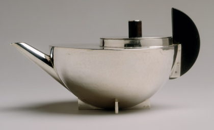
“Tea Infuser and Strainer” by Marianne Brandt
A great example of one of the most successful Bauhaus designs is the kettle by Marianne Brandt. Made from silver, the teapot is comprised completely from basic shapes such as a hemisphere for the main body, semi-circle for the handle and cylinders for the lid thus utilising the Bauhaus principle of function over form. One would think that this product would be less elegant than the other kettles on the market at that time, which composed of complex shapes and various intricate details. However, Marianne’s kettle looks more modern due to the simplicity and the “clean” look which is a result of this, allowing it to become a successful product as it is not only remembered to this day, but the design is still being sold.
Recently I had to design an earphone holder that would be
injection moulded, so I had to come up with several prototypes. I had to then put
them in an analysis tool to see if the prototypes would be able to be injection
moulded successfully, before I made a final mould. The earphone holder to the
left is the first design, and as you can see the details are more complicated
than the one to the right however the right design was chosen as the final
design.
The simpler earphone holder was chosen because the complexity of the first
design made it unable to be injection moulded easily as a lot of issues arose
with sink marks and improper filling. Utilising one of the main Bauhaus
principles which is function over form, all unnecessary details were removed to
simplify the model to make it easier to be injection moulded.
This is an example of the choice I had to make as a designer, sacrifice the
aesthetic look to improve functionality or sacrifice functionality for a more
appealing appearance? But most importantly, which one is the better design? Did
I make the right choice by sacrificing appearance for functionality? This
proves the point that “good design” is completely subjective to each
individual, some people will agree that I made the right choice, and some will
not, there is no clear line to which the better design is.
The relationship between taste and design and the role it plays when designing
an object is an intricate one, as the designer has to make a choice on how to
balance the aesthetic details and the functionality of their product. To make
it even harder, there is no aesthetic detail that will suit every individual as
everyone has different tastes, and it is also incredibly hard to make a product
that everyone will be able to feel comfortable using or understand how to use
as there are many factors such as symbology when it comes to the interface
design, and physical differences such as hand size. Therefore, good design is
extremely subjective to the individual and as a designer one has to identify
their target group and cater their product around that group, in order to
create a “good design” for those individuals.
Women have been constantly ignored in the workplace
throughout history, and in the design industry it is no different. More than
50% of GD graduates are comprised by women, a rate which is steadily increasing
however since the 1970s only one Woman was included in the AGDA Hall Of Fame. (Bruce
& Lewis) The AGDA’s own committee board is comprised of mostly males, and
the same goes for many design firms.
The Designing Women exhibition highlights the work of ongoing female designers,
celebrating their creations but also to give them a voice as they are often
overlooked in the male dominated industry. The exhibition is not limited to one
field of design but unites all female designers from all the different fields
in order to inspire both current and future designers whilst respecting the
contributions from female designers of the past.
This arrangement of artworks has a powerful image representation of the design industry, it represents the different challenges and experiences that women have faced whilst trying to succeed. The dress which is reflected in the mirror can be said to describe how the design industry is male dominated, even if the work a female artist produces is amazing the artist is overshadowed just because she is a female. This is reflective of the statistic that was presented earlier, how even though women are clearly present in the industry by making up more than 50% of the GD graduates hardly any of them gain any recognition.
The colour red of the dress represents the strength, determination and passion that female designers have for their art and are willing to persevere against the odds in order to have their work recognised and respected. This representation describes the experiences of Lynda Warner, who was placed in a time period where there were hardly any female designers as the industry was seen as one that were driven by males only and females were made to do dress making or secretary jobs. However, Lynda was determined to pursue her area of passion and with the support of her parents she completed her commercial art qualification at Swinburne university. She was then handpicked by a professional designer as her portfolio was so good, where she progressed to start her own career after his tutorage where she continued to succeed. (Connory, 2017)
Another interpretation of this is that the dress is the female’s artist career at her prime however, after entering parenthood it becomes muddied and uncertain as shown by the dull colours of the dress reflected in the mirror. This represents the social issues surrounding work and motherhood, as women tend to be looked over for promotions, paid less and assumed to be un-competent at her job just because she became a mother. This social issue is present in all areas of work, and it is no different here as from the experience of Michaela Webb, she found that she was discriminated against after trying to return to her career after having a child. In order to maintain her career, she had to shift the way she thought about work from the role of an active worker she became a more managerial one. These are only some of the social issues which continue to impact the women in the Industry and discourages them from seeking a career as a designer. (Connory, 2017)
There is also the social stigma that women should only do “feminine” work such as fashion and textiles, while men do the more practical work such as industrial design. (Connory, 2017) This combined with the other social issues creates several hurdles women designers have to overcome in order to be successful designers. These issues are represented by the many layers on the dress, as each layer presents each hurdle and as these hurdles build up over a woman’s career it forms several layers that the female designer has to cope with to maintain her career. For example, the first hurdle would be getting into the university for a design course which isn’t considered feminine, the second would be getting a job as a female designer and a third would be trying to fit motherhood into her career. (Bruce & Lewis)
The Designing Women exhibition cleverly depicts the problems and issues in the Design Industry of today by using female designer’s works which at the same time gives them exposure in order to help fix those issues. It highlights the many difficulties that women have to face in order to establish her own career as a designer, as well as to maintain it. These difficulties include the social issues and discrimination that arises due to motherhood, or simply being a woman. If we want to end these issues we must raise awareness about them, which is what the Designing Women exhibitions is trying to achieve.
Modernism is defined as a style or movement in the arts that aims to depart significantly from classical and traditional forms. It started as a radical break with the past and the co-current search for new forms of expression and fostered a period of experimentation in the arts from the late 19th to the mid-20th century, particularly in the years following World War I. Modernism is almost defined as minimalism in today’s definition, there is preference to acquire little of simple quality goods over, cheap and poorly manufactured goods in abundance – this is a result of the rapid growth and evolution in technology of our millennium- demonstrated in products such as Apple, which discourages backward progression and replacing things with new ways of reaching the same end. Technology was not the only evolutionary aspect of modernism as graphic design has fundamentally shifted to cleaner lines and shapes that communicate simplicity and effectiveness. As technology and design has both coexisted in the move towards modernism, we can explore how marginalised designers influenced the modernist products and ideologies we use today.
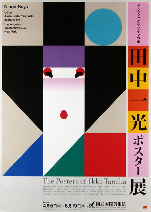
Ikko Tanaka is a graphic designer that fuses modern principles
and aesthetics with the Japanese tradition. He participated in many exhibitions
in the 1980s where he worked to introduce Japanese design overseas, his work married
his skills of Japanese calligraphy and Western typography, which made him
unique amongst his colleagues.
His designs features of strong elements of minimalistic yet
bold shapes with a clear link in modernist design movement. The abstract
formation of geometric shapes that Tanaka was talented for, never gained the
universal celebration for his work, however was equally instrumental in the
development of Japanese graphic design, evolving into a powerful visual
language is still recognised today. His work is well recognised for the
simplicity, utilisation of geometric shapes to communicate a bold yet
harmonious structure but with a Japanese twist- the illustration is subjective
to a modernistic lens, however recognisable as a geisha staying true to his
heritage. The deliberate sans-serif
typeface deviates from the traditional Japanese calligraphic works, located at
the top corner to elaborate the use of Helvetica- a font that is renowned for
its modernistic status quo of design. This
was his greatest legacy, fusing eastern and western design.
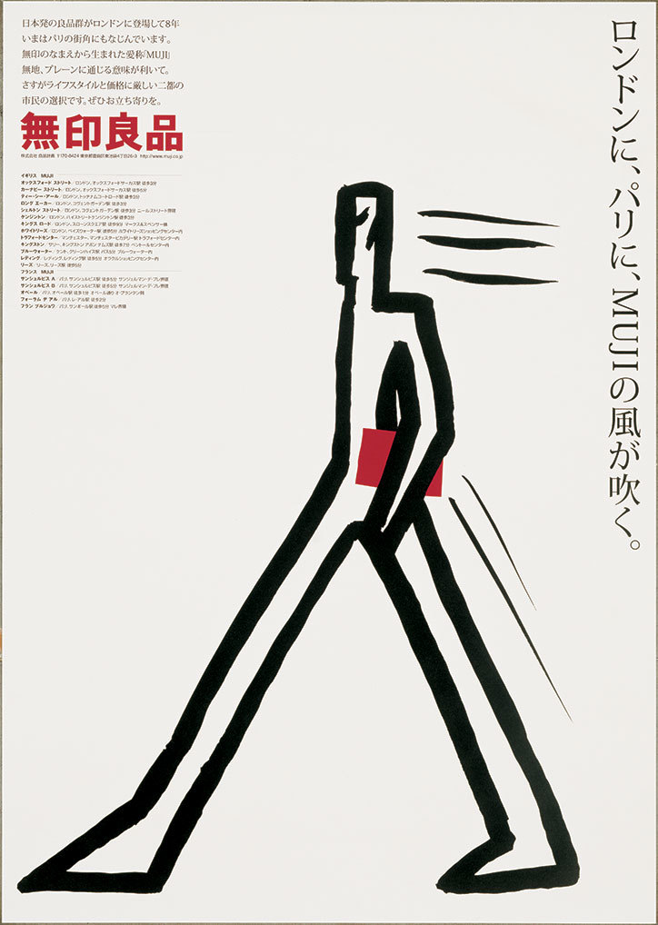
Ikko Tanaka: Muji poster (2000)
Ikko Tanaka was said to be the best at
keeping a traditional Japanese aesthetics in modern design, [1] his
significance lays in the art direction of MUJI, a lifestyle goods company that
focuses on minimalism and the elimination of excess items. His influence on the
company was visible in various facets of Japanese life from architecture and urban
landscape to social and personal mores. His design in particular was influential
in promoting a western way of life. [2]
The design philosophy holds a significant place in society today,
although it is a ‘non-brand’ brand, it signals through subtle behaviours, but
signals social class and informed knowledge. MUJI is based on three core
principles: 1. Selection of materials, 2. Streamlining of processes, and 3. Simplification
of packages. They omit the bleaching process
for pulp, the resulting paper is light beige in colour, using this for its
packaging and labels. Tanaka’s visionary ideas, beginning with monochromatic packaging
have remained the core of product design and marketing Muji’s entire identity.
This is an example of the prevalence in brand identity, by not bleaching the paper, Tanaka was able to simplify its
manufacturing processes and lower costs, while simultaneously drawing attention
to the beauty of the raw, natural product which considered the impact on the environment.
The significance of their rational manufacturing process marketed towards customers that were educated, informed and socially aware [3]. To agree with MUJI’s design philosophy, we had to inhibit self-actualisation, their ‘no-brand’ identity appealed to the idea of non-consumerism in the capitalist society, highlighting values and morals that concern the impact of waste. MUJI is a company that dedicates to produce sustainable products that can be used in myriad ways and till the time that they can be.
Tannaka’s footprint on the company demonstrates the importance
of branding identity as it unifies individuals with similar lifestyles. The ideologies
and attempt to promote the minimalistic lifestyle, introduces the acquisition of
satisfaction towards things that are simple and not over the top. We purchase things
from brands that align with our morals and values, I can conclude that somebody
who purchase from Muji are dedicated to a sustainability and optimal practise
whilst maintaining a clean and simplistic lifestyle. MUJI’s ‘no-brand’ identity
is effectively to move afar from brands with distinct characteristics, MUJI allows their customers to embrace their
personal meaning towards the things that they purchase the absence of logos make
it harder to recognize for their peers. Although it is debatable that those who
affiliate themselves with MUJI are also buying an idea, an idea to move away
from brands that entice responses of strong affinity. The following quote
demonstrates the prevalence of buying into an idea in all aspects of activities
or brands:T
“the unifying characteristic shared by members of this new elite cultural formation is their acquisition and valuing of knowledge rather than their income level. They use knowledge to attain a higher social, environmental, and cultural awareness” [4]
Ikko Tanaka’s influence on Japanese graphic design is
not limited to his prints, but his influence on MUJI’s identity that sold a
lifestyle. His talent married eastern and western design with his flair to
harmonize the distinct characteristics.
Deconstructed: The Hermès Himalaya Christies [https://www.christies.com/features/Deconstructed-The-Hermes-Himalaya-9532-3.aspx]
Studying Communication Design at Monash University is a platform for me to share my ideas and to identify myself as an aspiring designer, though the challenge of it all was, how am I awarded the marks if what I perceived as ‘good design’ was not ‘good design’? Subjectivity was painstakingly present in our classroom and the debate around how a criterion should be met, raised questions about, what is good design when the criteria was made to be the subject of what lead our decisions? Coming from an art background, it was always extremely hard to remove my perception of what was aesthetically pleasing in the realm of the design world meant, my definition of ‘aesthetic’, was if it was easy on the eye and evoked a happy emotion. As years progressed into the 3-year course, my understanding of what it meant to be functional in design occurred to me and developed a belief that design was a tool, less about what it looked like and what it delivered and therefore, represented.
Whilst analysing the
definition of ‘good taste’ is necessary, it is more essential to include the
significance of what lead up to attaining this sense of ‘good taste’. To what
extent, or to what number of products and ideas you have to acclaim to be
deemed to having good taste is debatable, it is endlessly subjective and never
definitive. An individual’s idea of beauty might consist of skinning a live
snake to produce a handbag, whilst another individual might think that this
process is unethical and therefore ugly.
Bruinius raises an
interesting claim that a person is regarded as exhibiting good taste if he or
she is refined in his or her dealings with other people, choice of clothes,
choice of home environment, opinions about art and so forth. Whilst this
definition is conclusive and rigid, it explores the idea that an individual
aspires to be accepted by society because, we purposely and strategically form
our personal ideas and opinions about things to make ourselves distinct from
society yet simultaneously accepted. This is relevant to how I personally
interact with society’s standard of beauty because it is prevalent and
applicable to my lifestyle in the sense that I purchase the makeup that
celebrities use, wear the gym gear that athletes wear and buy handbags with a
name on it. As a result of the financial damage done to my bank account, we
must consider the reasoning behind these egoistic purchases.
Being specific by the
things we wear, see, touch and eat is a curation of the things we want to
identify ourselves with. We are constantly bombarded by an infinite amount of
advertisements that crave our attention, only to which individuals can handle
an amount that is relative to their values, beliefs and morals. By accumulating
objects and ideas to define our identity, we raise the question about why we
want to pursue these objects to fit out particular taste or style. Though some
might deny that they do not actively curate their image, they identity themselves
by actions and behaviour towards things inherently define us as an individual.
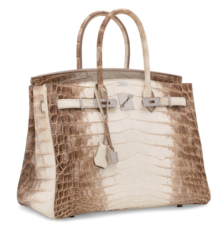
By interviewing high end designers, such as Nadège Vanhee-Cybulski, who is the Artistic Director Of Hermès, renowned for the iconic Birkin Bag, can we then understand her intention and creative thinking behind this controversial asset. She describes the Birkin as “timeless”, meaning that it will still remain beautiful if conserved in supreme quality as time makes its course. Leading up to obtaining one of the world’s most expensive bag, must you understand that it is a statement created to spark opinions about your financial status and taste in products, this is demonstrated by the hundreds of thousands of dollars invested for a bag could be replicated, duped and remanufactured but with cheaper materials. They are paying that amount of money because of its originality and scarceness – what does that say about ‘good design’? According to Vihma, 2007, states that “when it comes to design, it is often pointed out that a product must have content, not just appearance” [1]. Whilst this comment speaks volumes about what a Birkin bag represents, it demands understanding about the importance of design that coincides with the status symbol.
Nadège Vanhee-Cybulski could have designed an asymmetrical, dysfunctional and unattractive bag with the utmost divine materials, yet a small population would have thought it was grotesque. This feeds the idea that ‘good design’ exists, when it meets a level of criteria that gives it content and meaning, “the product should be well worked out from a holistic perspective that is, thoughts about the product are more crucial than its creation” [2]. The Hermes designer not only considered the effects of the deliberate design of the Himalaya, she utilised materials such as Albino Crocodile skin and valuable pieces of diamonds and gold detailing to attract the minority of wealthy individuals, knowing that they will be overlooking its design for its value. This to them is good design, because it inhibits these rare materials- I think it is neither functional nor beautiful, because of its incompatibility with my taste in patterns and structure. Purchasing a bag like this would serve me one purpose, to portray myself as somebody of higher status.
The relationship between ‘good taste’ and ‘good design’ is a subjective topic, only by giving meaning to what objects symbolise and communicate, presents to us of something of value when concerned with ourselves. As a designer myself, I seek to understand the intention behind charismatic design and the social influences that define the standard of beauty and therefore taste. It is important for me to understand that practises of design intend for different outcomes.
[1] Adam Mack (2012) The Politics of Good Taste, The Senses and Society, 7:1, 87-94, DOI: 10.2752/174589312X13173255802166
[2] Ask, T. (2004). God Norsk Design – Konstitueringen av Industridesign
som Profesjon i Norge. Academic dissertation, Oslo School of
Architecture, Oslo, Norway.
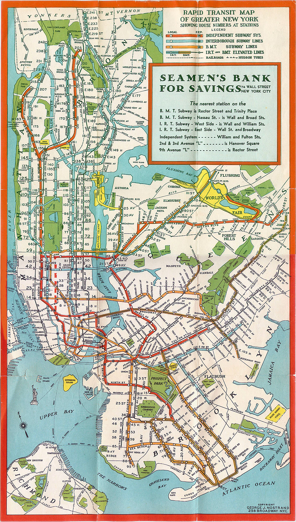
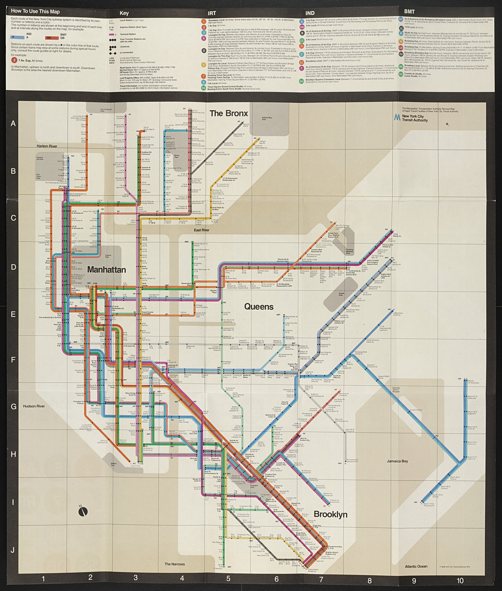
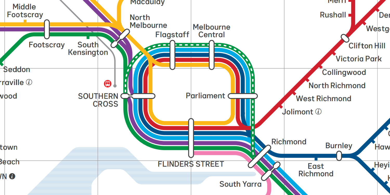
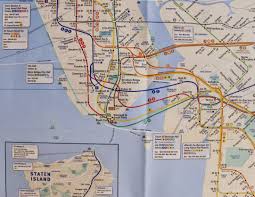
Massimo Vignelli was graphic and product designer responsible for many iconic designs such as graphics and products for many “Italian and European companies including Olivetti, Penguin Books, Piccolo Teatro, Pirelli, Poltronova, Triennale, the Venice Biennale, and Xerox”[1] however one of his most famous designs was of the New York city train map which has elements which are still being used till today and can be seen even permeating into other cultures, Melbourne’s very own train and tram map can be seen to drawn heavy similarities and inspirations from Vignelli’s maps.
New York city’s old map
Vigelli’s New York city train map
Melbourne’s train map
Vigelli’s design is now iconic among transportation maps, using the minimalist approach to designing the map while still retaining the spacial relativity of land marks and stations, the clean, simple and easy to understand design has allowed for easy planning as positions can be found quickly and effectively.
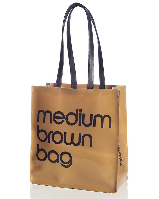
Massimo Vignelli was a firm believer of modernist principals his designs leaning upon the ideas of simplicity and geometric design, which can be seen in many of his works whether they be knives, maps or graphics he was of the leaders in spreading the ideas of mondernist design[2]. He is partially responsible for popularizing simple and clear typefaces, such as Helvetica which we can see being used both in his subway map design and many of his other designs use similar styles of typeface such as the bloomingdales bag which he designed.[3]
Massimo Vignelli’s medium brown bag desgin
Criticism
As a person who introduced modernist elements to maps his designs are not without those who are opposed to them, in fact when the subway map was first introduced it was met with harsh resistance with people struggling with the idea of the slightly wonky geography and gray and tan blocks representing parks and bodies of water. Vignelli obviously refuted those claims ” Of course I know Central Park is rectangular and not square,” Mr. Vignelli said the other day, sitting at a green marble table in his studio on East 67th Street. “Of course I know the park is green, and not gray. Who cares? You want to go from Point A to Point B, period. The only thing you are interested in is the spaghetti.” [4]. However in the end the Metropolitan Transport Authority (MTA) eventually caved to the demands of those against the map and 7 years after it’s release was replaced by a new design by Tauranac which kept the colored lines and dotted stations but returned the lines to their “spaghetti state” which Vignelli comments “Look what these barbarians have done,” he said as he examined his copy of the current map. “All these curves, all this whispering-in-the-ear of balloons. It’s half-naturalist and half-abstract. It’s a mongrel.”
Tauranac’s current New York city map
If i were to give my opinion, i would much rather prefer Vigelli’s design over Tauranac partially due to the fact that i am used to melbourne’s transport map, and also i am someone who enjoys the idea of form follows function and like the idea where maps are used to get from point A to B. However i can also see why his proposal was turned down when you look at the two maps and compare them you can see that there is large discrepancies in the placement of land marks, one of the most glaring examples of this is central park which has been squashed into a square not only falsely depicting it but also skewing the distance between landmarks where people who are unfamiliar with the city could be confused by the layout and get misled, this is due the fact that the map relies upon the users knowing the places where they are going meaning that people visiting new areas and tourist could be disorientated by this map.
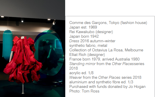
Designing Women exhibition in NGV is a design shows which focusing on the work, histories and achievements of designing women. This exhibition reveals that female designers, often overlooked in a male dominated industry, are producing sophisticated, iconic and thought provoking work. Though the exhibition, people may start concerning about design’s evolving history and what does it role in shaping contemporary society (Simone LeAmon, 2018). Although women have contributed to the design and manufacture of the physical world, however the historical stories of women in design are far less prominent than men.The reason for it is social and professional biases typically, that the most rigid manifestation of this occurs when all domestic and caring work within the family is denoted as ‘women’s work’, whilst waged work in the public domain is classified as ‘men’s work'(Margaret Bruce and Jenny Lewis, 1990). This blog will discuss some design works from Designing Women exhibition to analyzing the developmental status of women’s design, design concepts and design cases in recent years. Objectively analyze the achievements and shortcomings of women’s design from both positive and negative aspects, and try to explore the representational features and essential connotations of female design.
This dress (see Fig.1) by Dutch fashion designer Iris van Herpen, it was designed for Icelandic Pop singer, which took several month to make. This dress combine fuses machine and hand work to create the exaggerated form (NGV). Sleeveless blue dress formed from semi-transparent acrylic sheets that have been hand and laser cut and mounted onto a tulle ground to create a shell-like shape. The dress fastens down centre back with a long metal zip. Depending on the angle of the light, the dress changes colour from a very dark blue to a reflective light blue. The design is based on Iris van Herpen’s 2011 spring−summer Escapism collection This collection drew conceptually from feelings of emptiness, the grotesque and the fantastic, and aesthetically from the work of American artist Kris Kuksi (NGV). This work as both organic and innovative, it is most prominent feature of Iris van Herpen’s works. As journalist Vanessa Friedman said that
“It’s not that she rejects the heritage of the couture, she just redefines it with modern tools. Once upon a time the sewing machine did the same.”(Vanessa Friedman, 2018).
The design of this dress was based off her Escapism S/S 2011 collection, the whole themed around escaping reality through digital devices and entertainment, the entire Escapism collection was 3D printed, fashioned from materials like coral-looking metal silk, burnt metal weave, and shiny yarn hairs (Iris van Herpen, 2015).
Iris Van Herpen was one of the first designers to adopt 3D-printing as a garment construction technique. Extremely precise printing technology combines flowing tulle material with sophisticated craftsmanship. Through the use of color and the different brilliance of fabrics at different angles, people can see the beautiful life of different worlds. Herpen finds that form can change and complete the body of model,even affect emotions. She disagree with forms follow function, she try to organize the form, structure, and materials in a new way to bringing the best tension and behavior (Iris van Herpen, 2015). Before 19th century, it was unacceptable for women to do industrial design or technology work and ‘architecture was considered an all-male province’. The ‘proper’ design domains for women suit be Embroidery, lace-making, miniature painting, dressmaking. However design is not essentially technological or managerial, which is more above all creative, involving exceptional visualization skills. Design research is both academic and practical, with designers investigating new processes, materials, systems and methods (Simone LeAmon, 2018). From Herpen’s design, it is combine fashion and high technology, using new techniques, not the re-invention of old ideas. The dress looking at the hidden beauty at the intersection of precision and chaos, art and science, the artificial and the organic, that are blending into infinite hybrids.
Herpen has been preoccupied with inventing new forms and methods of sartorial expression by combining the most traditional and the most radical materials and garment construction methods into her unique aesthetic vision. It can emphasize that the typically ‘feminine’ areas of design should not be disparaged in order to encourage more women into product and industrial design. The traditionally female skills involved in designing jewellery, textiles, ceramics and fashion clothing are highly creative, and just as important for our aesthetic and commercial futures (Margaret Bruce and Jenny Lewis, 1990).
According to Dewey’s design ethics, public problems was relevant with the context of design studies, which links contemporary world conditions through its pluralistic stance, endorsing a public that is broad, inclusive, and multiple. Public influence is a significant part, which designer need to consider carefully before they are designing a work. As Dewey’s thought that the public can be a philosophical subject, and the grounded of it was base on the concrete situation, experience, and materiality of daily life. The philosophical investigation of the public should be divorced from the “facts” of everyday life(Carl DiSalvo, 2009). The design is an inherently ethical activity, especially in public design, which has a huge influence on how people behave and live their lives. Solving problems and making people’s lives better as a purpose for all the designer.
In essence, the constitution of a public design did not rely on the design style, design model and genre of art, but on the spatial spirit of collective or group. It is the external condition for human beings to transform their living environment as a whole. While human history and culture determine the characteristics of public art, public art also has directly or subtly influenced and transforms on concepts of human cultural and aesthetic models (Carl DiSalvo, 2009). For example, some works on the Designing Women Exhibition, which are references design’s own mainland culture heritage and rituals. Lee Darrouch’s works(see, Fig.1) have single-handedly revived the sacred cultural practice of possum cloak making in Aboriginal Victoria. From the works, people can learn the story of identity, Yorta Yorta Country, and the Dhugula, Kaila, and Yalooka rivers, in addition to her compelling family history(NGV). The public design respects the natural original ecology and emphasizes the heterogeneous ecological and cultural experience. It is the most fundamental continuation of the cultural context and the extension of the public constitution. Genesy Lamp by Zaha Hadid(see, Fig.2), Zaha got design inspired by the growth patterns of trees within a forest. Zaha has used advanced design and manufacturing technology placed her at the forefront of architectural and design practice for nearly forty years. The characteristics of her design is a beauty, which is connected to innovation, future technologies, and social progress(NGV). The designer’s background history and culture determine the characteristics of their artworks. Furthermore, the tactic of tracing is characterized by the use of designerly forms to creatively express the histories, discourses, and techniques that constitute an issue; in ways that foster knowledge through engagement(Carl DiSalvo, 2009). Increasingly, these forms reach beyond the common artifacts of communication design. In this way, tracing both connect with and extends contemporary design, particularly the areas of participatory and service-oriented practices that embrace forms of engagement and exchange beyond the traditional object(Carl DiSalvo, 2009).
As Dewey said:
“Artists have always been the real purveyors of news, for it is not the outward happening itself which is new, but the kindling by it of emotion, perception, and appreciation(Carl DiSalvo, 2009).”
The public design respects the natural original ecology and emphasizes the heterogeneous ecological and cultural experience. It is the most fundamental continuation of the cultural context and the extension of the public constitution (Matthew Holt, 2015).
Any culture will provide individuals within the cultural circle with a cognitive model and behavioral model that deals with the relationship between people and people. At this level, culture itself can be understood as a specific cultural environment in which a particular natural environment in which humans adapt to a particular environment accumulates a specific cultural and ecological experience, thereby affecting individual thinking patterns and values within the cultural circle(Feldman and Roberta, 2003). At every level of social life, in the long-term survival and development process, specific social culture is gradually derived through the interaction between individuals and individuals, individuals and groups, groups and groups. It includes the knowledge, beliefs, customs, religions, art, laws, ethics, taboos, and the recognition of the material world and the technology of creation in the process of long-term survival and development of a region or nation, including people themselves in society. All the experiences, abilities, and customary habits gained in the operation are the sum of all the material and spiritual achievements created by mankind(Feldman and Roberta, 2003). Such as me, the traditional Chinese elements is an unchangeable theme of my design. People can clearly see a Chinese style in most of my artworks. Design is also a part of the cultural category and general theory. It is an organic part of human culture. Its public nature and its own urban cultural attributes determine that it must be influenced by specific social culture and mode of thinking.
Specifically, within The Public and Its Problems are leads to investigating and understanding the ways in which the products and processes of design intersect with the public. Of these leads, the notion that publics are “constructed” is perhaps most salient to contemporary design because it prompts a consideration of the means by which publics are assembled. For instance, the public art BLOOM(see, Fig.3), designed by Alisa Andrasek and Jose Sanchez. It staged as a dynamic installation; a swelling, neon pink structure, which is the official Olympics color, BLOOM is conceptualized as an urban toy, a distributed social game and collective “gardening” experience that seeks the engagement of people in order to construct fuzzy BLOOM formations(NGV). It considers a mode of assembly, disassembly, and re‐usability that challenges the notions of traditional construction. The lifespan of this work is undetermined as it allows the project to adapt and reappear in many different places and occasions. The collective act of coming to one place and building something becomes a shared memory for each person attending. The energy for this design construction is sourced from people’s interactions( RMIT).
Design ethics is an important issue that needs to be attending. A good design should bring a positive influence on the public. The subject of design ethics should go hand-in-hand with the construction of the public and have a significant place in future discourse. A good design with the public meaning can evoke people’s thinking and understanding of related issues and express the history and value of the community or city(Colebatch, 2018). Designer should not sever a connection with public life. They should communicate with the public, to discover the issues of social life and people’s feeling. In this sense, public art has a powerful force that changes the face of the city and can influence the public’s mental state and perception of the surrounding world for a long time. Even it will also become the icon of the city’s identity(Colebatch, 2018). So, design needs to be integrated into life, it plays an extremely important role in shaping the unique character of contemporary life.
Reference
Di Salvo, C 2009, Design and the Construction of Publics, Design Issue, vol.25, no.1, pp. 48-63.
Holt, M 2015, Transformation of the Aesthetic: Art as Participatory Design, Design and Culture, vol.7, no.2, pp. 143-165, DOI: 10.1080/17547075.2015.1051781.
Feldman, Roberta M. 2003. “Activist Practice: The Risky Business of Democratic Design.” In Good Deeds, Good Design: Community Service through Architecture, edited by Bryan Bell, 109–114. New York: Princeton Architectural Press.
Colebatch, H 2018, The idea of policy design: Intention, process, outcome, meaning and validity, “Public Policy and Administration”, vol. 33, no. 4, pp.365–383.
Figure.3, Installation view of Designing Women at NGV International – photo by Tom Ross.
Figure.1, Installation view of Designing Women at NGV International – photo by Tom Ross. Figure.2, Photo download from NGV website. Zaha Hadid (designer) ,Iraq 1950–2016, Artemide, Pregnano (manufacturer), Italy est. 1960,Genesy 2009, metal, lacquered polyurethane, light-emitting diode (LED). Figure.3, Installation view of Designing Women at NGV International – photo by Tom Ross.
Designer, magician of emotion. The difference between designers and engineers or pattern makers is designers are good at transferring emotion and personality to their design, let their woks have temperature and have stories can tell to the users and audiences. In other words, designer make intangible feelings present in a sensed way. Compare with engineers and pattern makers, they focus on the function, solve the physical problem and translate designer’s idea to reality.
The feeling of emotion, depends on a very wide levels, such us personal experiences and cultural backgrounds. We can not find a person, who has the exactly same life experience with us, everyone may have different feeling and comments of the designs. How designers can design their works to let people empathetic?
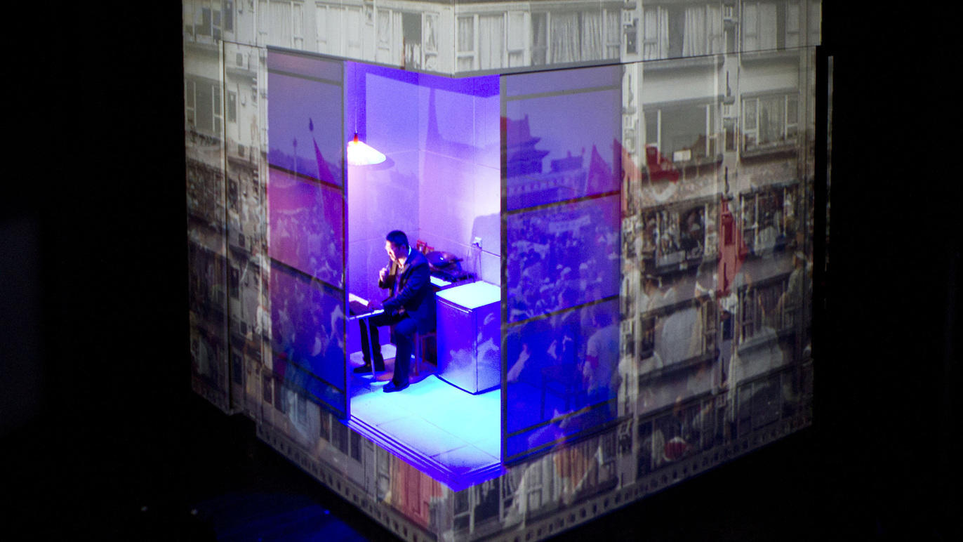
“Devlin was devising her own great (Oliver award-winning) white box- a revolving cubic stage design for Lucy Kirkwood’s Chimerica of 2013”. [1] The stage was design for Lyndsey Tuner, the director of the drama. “This is a thoughtful, complex portrait of New York photojournalist Joe Schofield’s search for the subject of his most iconic picture: a lone Chinese protestor who stood in front of a column of tanks in Tiananmen Square on June 5 1989. Here, Chimerica is a fragile web of shifting human relationships, which are sometimes severed by corporate greed, state cruelty, or individual selfishness, but achieve moments of connection which transcend their inhospitable environment”.[2]
Delvin, as a British set designer, how did she present the two big countries’ interaction and contradiction that she did not have much personal experience of these countries, and how she translate the photojournalist’s feeling and emotion in his photos to three dimensions stage? “We cannot have a reductive theory of design’s totality or its specific sign functions if we are to understand its multiple forms. In the geography of design, where meaning shifts by movement and conjuncture, there is no essence outside of a logocentric view”.[3] We can not form ourself in a confined space or comfort zone to design, especially when the inspiration and way of telling the story we want is different to our experience and background.
In the design of Lucy Kirkwood’s Chimerica, Delvin was combining scenes taking place in both countries through a cleverly devised box that rotates as video projections and photographs are cast on to its sides. We can see is not only a rotating white cube displaying photographs, but also presenting the photojournalist’s emotion of contradiction and shock by overlaying and changing the transparency of the photographs across the show. The aim is to make the audiences have entire new visual and thinking stimulation through the rotate of the cube.
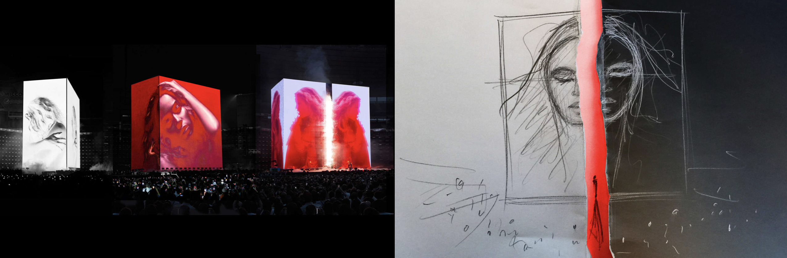
The main structure of most Delvin’s designs is playing around with the geometric shape, such as the stage designed for Beyonce’s 2015 Formation Tour. Similar with the stage of Lucy Kirkwood’s Chimerica, it is a rotatable cube, but larger scale and more complex elements. During the concert, audiences feel exciting when the form and the angle of the cube is keep changing. For example, the cube can separate to two parts, so in the third part of the. concert, Beyonce walks out from the cube, and the collocation with dazzling lights, which is the audiences can not expect.
From these designs of Delvin, we can strongly feel her personality and how deep she researched her clients. She did not framed by her background like where she born and where she grew up. She make people see her talent first, then people would like to explore her background to figure out what life experience she had to support her became a good designer.“Marginality is being on the edge or outside of the relations of exchange, no matter where they are located, on what scale they might be, or who or what is powering the activity.”[4] No matter where you from, where you live, if you got talent, then all you have to think of is how to express your designs to the world, just like Delvin. But we can still say Delvin is a ‘forgotten hero’ because she born in Europe, the central of the world trend culture, where grows more talented designers and artists compare with other continents in the world, so it is really hard to be seen in that area. After designed numbers of stage for drama, fashion shows and concerts, she started design architecture like she has been chosen to create the UK Pavilion at the Dubai Expo 2020, with a performative structure that will use artificial intelligence to write poems.
In conclusion, interdisciplinary design is the trend to simulate new design thinking and idea, and designers can combine their profession and express their emotion by different ways.
[1]Libby Sellers, Women Design
[2] Caroline McGinn, Chimerica. Accessed April 2 2019
Female
design practitioners have been in the shadows in design history and practice.
The explanation as to this comes in many forms with the struggle against social
order and gender expectations at the fore front. Breaking through the barriers
is no easy feat for many women designers in their careers. An aspirational
woman who has lead the way for female graphic designers in history is Alison
Forbes. As one of Australia’s most awarded book designers Alison become the
first full-time independent book designer in Australia[1].
With a body of work that is of quality and uniqueness Alison’s career mark in
Australian design history is one to be celebrated.
Alison
Forbes studied and graduated from Melbourne Tech (now RMIT) and launched her
career which carried across more than five decades. While studying design and
illustration one of Alison’s lecturers told her that she will “never make a
living designing jackets”[2].
Designing not only jackets but complete books has been the portfolio of work
that Alison has achieved in her career in publishing which has been her
success.
The
post-war period for publishing houses were quite different to what is known
today. Alison describes that “quite often there was only one person in a
publishing house”, with access to various resources being quite difficult and
limited as “you couldn’t use
italics much anywhere”[3].
The small numbers in these publishing houses also benefited the work produced
as Alison was able to communicate with key decision makers in industry[4].
The involvement in the process strengthened the outcome as it became an
integral part to Alison to receive insight and even liaise and access the
author’s ideas of the publication she was designing. The financial reward that
came with working for advertising agencies at the time were tempting for many
designers. Despite this Alison focused on her body of work and remained solely
on book design. The integrity of her work shines through as a result of this.
Alison’s first award in 1955 from the Australian Book Publishers Association (ABPA) Books of the Year was awarded for the design of Alan Marshall’s I Can Jump Puddles. The illustrations of the excited and curious young boys on the cover accompanied by their loyal companion evokes feelings of wonder and hope. The faded red and khaki green are used in harmony with the sketched black contrasting as well as the white. The colours speak of an Australian landscape with red outback dust and green nature coming together. The classic serif fonts tie well with the illustration seaming quite natural blending in with the leaves and grass in the image. Some of Alison’s other favourite and famous Australian designs include The Land that Waited and Picnic at Hanging Rock[5].
Designs
exhibited by Alison are of significance today not only because she is a woman
or because of her integrity in process, but because of her design talent. In
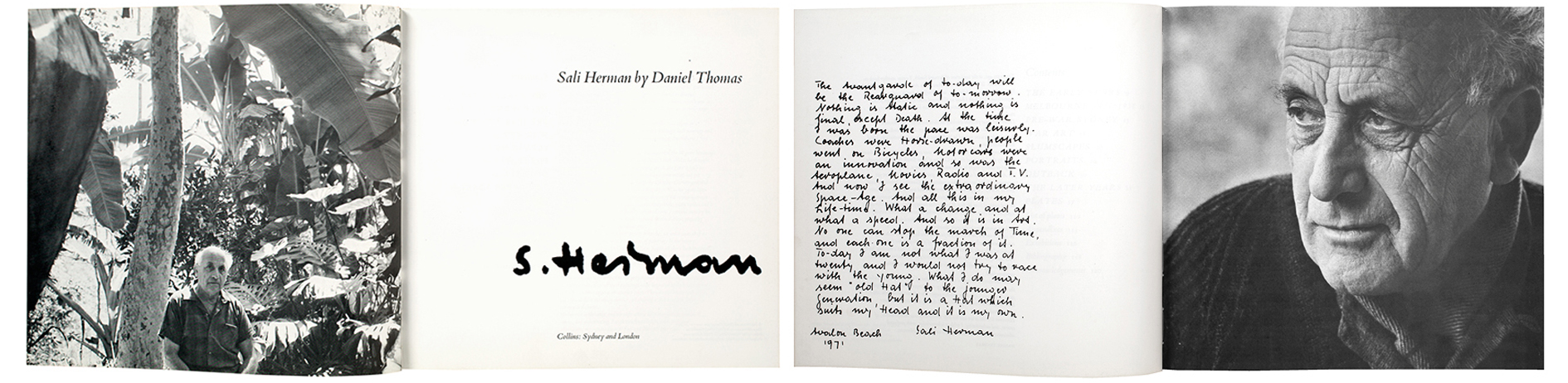
1971 Alison designed the book Sail Herman
by Daniel Thomas. The design has modernist aspects with the use of white
space and minimalistic typographic elements. The hand written type makes the
feel of the book personal and links well with the black and white photography.
Nostalgic feelings come from the design even as it is quite modern in its
approach. By contrasting a typed serf font with the hand written bold signature,
the book speaks of uniqueness to the man it is written about. Designs like
these were a jump from the initial work Alison did upon graduation which
involved “drawing happy housewives taking casseroles out of ovens”[6].
From starting off with tasks like so is coincidental as the gender stereotype
that society is accustomed to was able to be challenged and overcome by Alison.
The
creative integrity held by Alison and her mark for female designers holds as a
relevant aspiration today. It is found that women have consistently comprised
over 50% of graphic design graduates since the 1970s however this does not
equate and reflect itself in the workforce[7].
With the barrier of social norm, women such as Alison have created their own
opportunities to mark presence in the design field and have affirmed that you
can make a living by designing. For recent graduates it is important to be in
tuned with the history of women in design as they have set the path for
success. Visibility of these women in history is needed to confirm that changes
are possible as we are steadily making progress towards removing social
barriers and gender based norms. Gaining insights into the successes and
failures of the processes that were undertaken may inspire a new generation of
female designers in industry.