‘You’ll never make a living designing jackets’

Female design practitioners have been in the shadows in design history and practice. The explanation as to this comes in many forms with the struggle against social order and gender expectations at the fore front. Breaking through the barriers is no easy feat for many women designers in their careers. An aspirational woman who has lead the way for female graphic designers in history is Alison Forbes. As one of Australia’s most awarded book designers Alison become the first full-time independent book designer in Australia[1]. With a body of work that is of quality and uniqueness Alison’s career mark in Australian design history is one to be celebrated.

Alison Forbes studied and graduated from Melbourne Tech (now RMIT) and launched her career which carried across more than five decades. While studying design and illustration one of Alison’s lecturers told her that she will “never make a living designing jackets”[2]. Designing not only jackets but complete books has been the portfolio of work that Alison has achieved in her career in publishing which has been her success.

The post-war period for publishing houses were quite different to what is known today. Alison describes that “quite often there was only one person in a publishing house”, with access to various resources being quite difficult and limited as “you couldn’t use italics much anywhere”[3]. The small numbers in these publishing houses also benefited the work produced as Alison was able to communicate with key decision makers in industry[4]. The involvement in the process strengthened the outcome as it became an integral part to Alison to receive insight and even liaise and access the author’s ideas of the publication she was designing. The financial reward that came with working for advertising agencies at the time were tempting for many designers. Despite this Alison focused on her body of work and remained solely on book design. The integrity of her work shines through as a result of this.

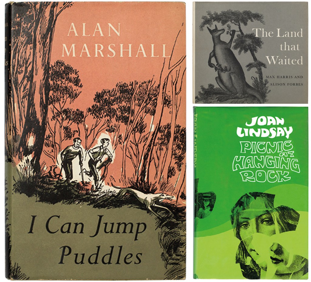
Alison’s first award in 1955 from the Australian Book Publishers Association (ABPA) Books of the Year was awarded for the design of Alan Marshall’s I Can Jump Puddles. The illustrations of the excited and curious young boys on the cover accompanied by their loyal companion evokes feelings of wonder and hope. The faded red and khaki green are used in harmony with the sketched black contrasting as well as the white. The colours speak of an Australian landscape with red outback dust and green nature coming together. The classic serif fonts tie well with the illustration seaming quite natural blending in with the leaves and grass in the image. Some of Alison’s other favourite and famous Australian designs include The Land that Waited and Picnic at Hanging Rock[5].

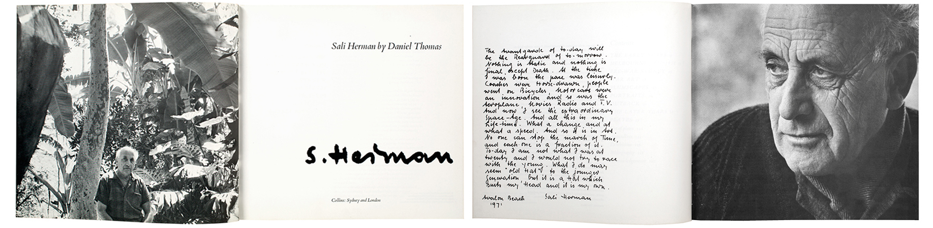
Designs exhibited by Alison are of significance today not only because she is a woman or because of her integrity in process, but because of her design talent. In 1971 Alison designed the book Sail Herman by Daniel Thomas. The design has modernist aspects with the use of white space and minimalistic typographic elements. The hand written type makes the feel of the book personal and links well with the black and white photography. Nostalgic feelings come from the design even as it is quite modern in its approach. By contrasting a typed serf font with the hand written bold signature, the book speaks of uniqueness to the man it is written about. Designs like these were a jump from the initial work Alison did upon graduation which involved “drawing happy housewives taking casseroles out of ovens”[6]. From starting off with tasks like so is coincidental as the gender stereotype that society is accustomed to was able to be challenged and overcome by Alison.

The creative integrity held by Alison and her mark for female designers holds as a relevant aspiration today. It is found that women have consistently comprised over 50% of graphic design graduates since the 1970s however this does not equate and reflect itself in the workforce[7]. With the barrier of social norm, women such as Alison have created their own opportunities to mark presence in the design field and have affirmed that you can make a living by designing. For recent graduates it is important to be in tuned with the history of women in design as they have set the path for success. Visibility of these women in history is needed to confirm that changes are possible as we are steadily making progress towards removing social barriers and gender based norms. Gaining insights into the successes and failures of the processes that were undertaken may inspire a new generation of female designers in industry.


[1] Jane Sullivan, “Turning Pages: The brilliant career of Alison Forbes, designer”, Entertainment, The Sydney Morning Herald, May 18, 2018, accessed April 4, 2019, https://www.smh.com.au/entertainment/books/turning-pages-the-brilliant-career-of-alison-forbes-designer-20180510-h0zx0a.html.

[2] Ibid

[3] Ibid

[4] AGDA, “Hall of Fame / Alison Forbes”, Australian Graphic Design Association, accessed April 4, 2019, https://www.agda.com.au/inspiration/hall-of-fame/alison-forbes/.

[5] Re:collection, “Alison Forbes”, Re:collection, accessed April 4, 2019, https://recollection.com.au/biographies/alison-forbes

[6] Ibid

[7] Jane Connory, “Plotting the Historical Pipeline of Women in Graphic Design”, dharn.org.au, 2017, accessed April 4, 2019, https://lms.monash.edu/pluginfile.php/8323632/mod_resource/content/1/Wk%209%20Plotting-the-Historical-Pipeline-of-Women-in-Graphic-Design_171117.pdf

Wastefulness is Negligence

Welcome to Wasteland, Besser Space Collingwood.

The ideas of a Wasteland have been derived from the Latin meaning of waste which is uncultivated/unoccupied[1]. The bases of the manifesto for the exhibition ‘Welcome to Wasteland’ is an explanation of these original meanings. With focus upon land and waste the exhibition holds products and art created from products of waste. Industrial designers, graphic designers and architects were asked to create a product out of waste for the exhibition. All together 32 designers across various disciplines participated and contributed to the final exhibit. Hosted in Besser Space in Collingwood the works were displayed as part of Melbourne Design Week provoking thought into our production of waste and the transformation of it.

Exploration of the use of waste materials exhibited is vast ranging from pigs blood to coffee grounds, to materials such as wood and marble. Insight was provided as to how leading practitioners are approaching the Australian waste issue. The question arises as to the responsibility of designers when regarding issues of waste and sustainability. The manifesto for Wasteland states that ‘the act of making wasteful products is negligence’[2]. The statement is direct and clear calling on designers to be able to sustain their field. By not designing sustainably does the result still classify itself as good design? Is it okay to not consider the implications of designs produced or is that as stated negligence? By making ethical design practices known to industry we may then explore the results of good design at the heart of production.

In the centre of the exhibition, on a pedestal, stood the collection of waste produced from the designers during production of the objects for the exhibition. This centre piece statement reiterates that waste is at the heart of the exhibition[3]. The placement of the waste is seen growing up from the toilet in the centre and also spreading around the base. The choice of displaying the waste objects in this manner instead of an organised one also demonstrates the carelessness for discarded waste. Materials of all sorts were included and only sharp knifes or tools were omitted for safety purposes. The collection in the centre also speaks as to the amount of waste that is produced. It provokes thinking as to what the centre would look like for waste beyond the production of only 32 objects.

Designer Morgan Doty contributed to the exhibition with her CMYK Stools. The 4 stools were created out of waste paper, biodegradable glue and American oak. The stools explore the concept of paper being given a more permanent use as furniture. The use of paper is short lived as someone may write something down then throw the page away instantly. This contrasts to the form of furniture which is an object that is used repeatedly over a longer life span. The shredded paper pulp was moulded and combined with digital fabrication techniques to achieve the shell structure of the top of the furniture stool. The stools act as a physical manifestation of printing with each stool representing the ink based colours CMYK (cyan, magenta, yellow and key). The materiality of the stool is stated with the textured surface displaying fragments of text from the waste paper. The rawness of materials impacts the design and makes each stool unique even though they are all uniform. Designing with a message and purpose is seen in this work with a sustainable re use of waste material. Morgan states that ‘each tonne of paper recycled saves 13 trees, 331,780 litres of water, 2.9 tonnes of CO2 emissions and 4 cubic meters of landfill’[4]. This large impact communicated places the stools in perspective and re affirms the impact of recycling.

Critiquing whether the design presented is classified as good design comes from the intention of the designer. Good design is seen to be acknowledged by colleagues as being creative, imaginative, skilful and having a certain depth in thought and intention[5]. Even as the materials used are classified as waste, the re-production with purpose and meaning brings the waste into a new life. Good design and good taste are often used interchangeably although the concepts of each vary. The thought and intention of the recycled waste as products may be seen as good design but does that result in it being tasteful design. Is a pile of waste in an exhibition considered design and of good taste? In analysing what is considered good taste it is found that taste is socially constructed. Therefore, it speaks of the systems and processes people create as the criteria for determining what is considered as good taste[6]. As a society the wastefulness and negative impacts of mass consumption are on a grand scale. By coming to terms with wastefulness and by not neglecting our impact this could socially construct a new criterion of what is considered to be of good taste.

The exhibition Wasteland in my opinion is of good taste and design as it generates meaning for users and viewers of the works. The intentions of each of the 32 designers work towards the overarching concept to not be negligent when it comes to waste. Products produced provided opportunities for the discarded functional objects to exist beyond their intended destination of disposal and landfill. Not only were the creation of these objects sustainable but the production and display of the exhibition also adopted sustainable processes. Examples of this include the solar powered web server which runs the website for the exhibit. Another example is seen as the text on the exhibit walls were done using a hand-held gun as an alternative to printing on large rolls of paper. All elements of the exhibition create a sense of awareness and call on designers to take an un wasteful approach.


[1] Friends and Associates, “Welcome to Wasteland,” Wasteland, accessed April 7 2019, http://solar.friendsand.associates/

[2] Ibid

[3] Friends and Associates, “friends.associates,”, accessed April 7 2019, https://www.instagram.com/friends.associates/

[4]Friends and Associates, “Morgan Doty CMYK Stool,” Wasteland, accessed April 7 2019, http://solar.friendsand.associates/waste-paper-biodegradable-glue-american-oak

[5] Despina Christoforidou, Elin Olander and Anders Warell, “Good Taste vs. Good Design: A Tug of War in the Light of Bling,” The Design Journal 15, no. 2 (2012): 187-191.

[6] Ibid