Modernism is defined as a style or movement in the arts that aims to depart significantly from classical and traditional forms. It started as a radical break with the past and the co-current search for new forms of expression and fostered a period of experimentation in the arts from the late 19th to the mid-20th century, particularly in the years following World War I. Modernism is almost defined as minimalism in today’s definition, there is preference to acquire little of simple quality goods over, cheap and poorly manufactured goods in abundance – this is a result of the rapid growth and evolution in technology of our millennium- demonstrated in products such as Apple, which discourages backward progression and replacing things with new ways of reaching the same end. Technology was not the only evolutionary aspect of modernism as graphic design has fundamentally shifted to cleaner lines and shapes that communicate simplicity and effectiveness. As technology and design has both coexisted in the move towards modernism, we can explore how marginalised designers influenced the modernist products and ideologies we use today.
Ikko Tanaka is a graphic designer that fuses modern principles and aesthetics with the Japanese tradition. He participated in many exhibitions in the 1980s where he worked to introduce Japanese design overseas, his work married his skills of Japanese calligraphy and Western typography, which made him unique amongst his colleagues.
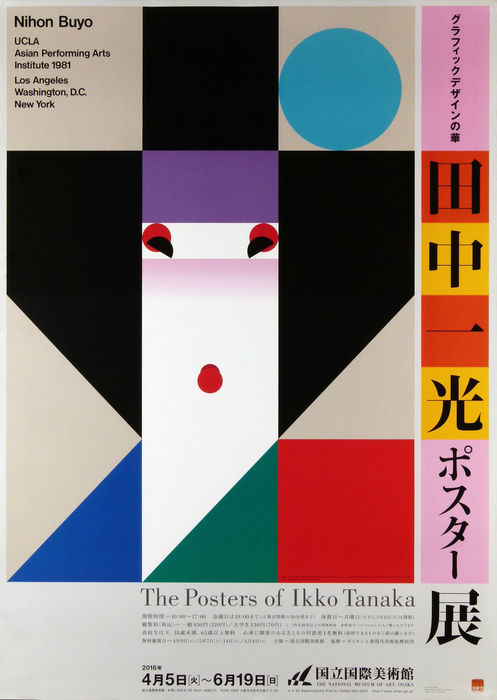
His designs features of strong elements of minimalistic yet bold shapes with a clear link in modernist design movement. The abstract formation of geometric shapes that Tanaka was talented for, never gained the universal celebration for his work, however was equally instrumental in the development of Japanese graphic design, evolving into a powerful visual language is still recognised today. His work is well recognised for the simplicity, utilisation of geometric shapes to communicate a bold yet harmonious structure but with a Japanese twist- the illustration is subjective to a modernistic lens, however recognisable as a geisha staying true to his heritage. The deliberate sans-serif typeface deviates from the traditional Japanese calligraphic works, located at the top corner to elaborate the use of Helvetica- a font that is renowned for its modernistic status quo of design. This was his greatest legacy, fusing eastern and western design.
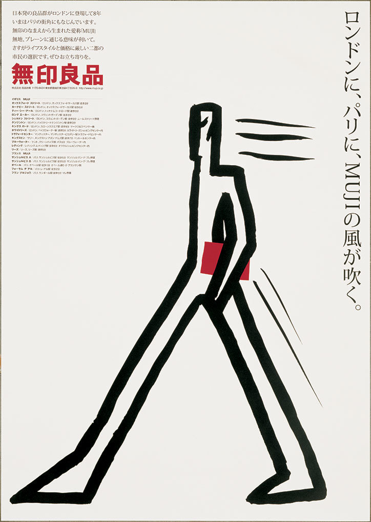
Ikko Tanaka was said to be the best at keeping a traditional Japanese aesthetics in modern design, [1] his significance lays in the art direction of MUJI, a lifestyle goods company that focuses on minimalism and the elimination of excess items. His influence on the company was visible in various facets of Japanese life from architecture and urban landscape to social and personal mores. His design in particular was influential in promoting a western way of life. [2]
The design philosophy holds a significant place in society today, although it is a ‘non-brand’ brand, it signals through subtle behaviours, but signals social class and informed knowledge. MUJI is based on three core principles: 1. Selection of materials, 2. Streamlining of processes, and 3. Simplification of packages. They omit the bleaching process for pulp, the resulting paper is light beige in colour, using this for its packaging and labels. Tanaka’s visionary ideas, beginning with monochromatic packaging have remained the core of product design and marketing Muji’s entire identity. This is an example of the prevalence in brand identity, by not bleaching the paper, Tanaka was able to simplify its manufacturing processes and lower costs, while simultaneously drawing attention to the beauty of the raw, natural product which considered the impact on the environment.
The significance of their rational manufacturing process marketed towards customers that were educated, informed and socially aware [3]. To agree with MUJI’s design philosophy, we had to inhibit self-actualisation, their ‘no-brand’ identity appealed to the idea of non-consumerism in the capitalist society, highlighting values and morals that concern the impact of waste. MUJI is a company that dedicates to produce sustainable products that can be used in myriad ways and till the time that they can be.
Tannaka’s footprint on the company demonstrates the importance of branding identity as it unifies individuals with similar lifestyles. The ideologies and attempt to promote the minimalistic lifestyle, introduces the acquisition of satisfaction towards things that are simple and not over the top. We purchase things from brands that align with our morals and values, I can conclude that somebody who purchase from Muji are dedicated to a sustainability and optimal practise whilst maintaining a clean and simplistic lifestyle. MUJI’s ‘no-brand’ identity is effectively to move afar from brands with distinct characteristics, MUJI allows their customers to embrace their personal meaning towards the things that they purchase the absence of logos make it harder to recognize for their peers. Although it is debatable that those who affiliate themselves with MUJI are also buying an idea, an idea to move away from brands that entice responses of strong affinity. The following quote demonstrates the prevalence of buying into an idea in all aspects of activities or brands:T
“the unifying characteristic shared by members of this new elite cultural formation is their acquisition and valuing of knowledge rather than their income level. They use knowledge to attain a higher social, environmental, and cultural awareness” [4]
Ikko Tanaka’s influence on Japanese graphic design is not limited to his prints, but his influence on MUJI’s identity that sold a lifestyle. His talent married eastern and western design with his flair to harmonize the distinct characteristics.
[1] Kazuko Koike: A life with Muji, accessed 4 April 2019,https://medium.com/@jaranda.des/biography-tanaka-ikko-v-2-68f34c95cc3a
[2] Kazuko Koike: A life with Muji, accessed 4 April 2019,https://medium.com/@jaranda.des/biography-tanaka-ikko-v-2-68f34c95cc3a
[3] Juliana Luna Mora, The Yoda Industry: A Conscious Luxury Experience In the Transformation Economy
[4] Juliana Luna Mora, The Yoda Industry: A Conscious Luxury Experience In the Transformation Economy