What makes a product be considered as a good design? Is it how much they sell for, how many of that product was sold, or how much personal value the product has to the individual or the designer himself? There is no clear answer as designers all have different values to which they adhere to, which impact the decisions they make whilst designing and what they design.
The relationship between taste and design is important to creating a successful product in my opinion, as the product needs to look attractive and be able to fulfil its purpose as well. From the reading “Good Taste vs Good Design”, it describes taste as being completely subjective to the individual as it is based on their many factors such as values, social status, up-bringing and wealth. It also describes how good design comes from competence and being based on professional skill. The main argument is which component, that is taste or design should be prioritised while designing a product? Or should there be a balance between the two?
I think that there is no clear answer to this argument as for example, luxury products such as high heels are extremely uncomfortable to wear and hurts the user which makes it a badly designed product, however people still wear it because of the aesthetic looks. On the other hand, Ikea products are extremely simplistic and focuses on the functionality of the product rather then implementing aesthetic features which could increase the price of the product, making it less appealing towards low income customers.
The Bauhaus is a good example of designers who experimented with the balance between aesthetic design and functionality. The other designers during that time prioritised aesthetic looks over functionality which resulted in products that did not work to their full potential and only available to families with huge incomes. Instead, the Bauhaus prioritised functionality leading to one of their most important principles which Is function over form. This allowed low income families to have access cheaper products which actually worked better then their more expensive alternatives, and surprisingly the simplified products had a feel of “modernity”, or a futuristic air around them as they were so different and looked extremely clean compared to the other products who were over crowded with detail making them look messy and confusing.
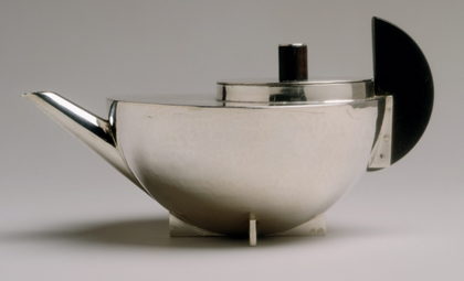
A great example of one of the most successful Bauhaus designs is the kettle by Marianne Brandt. Made from silver, the teapot is comprised completely from basic shapes such as a hemisphere for the main body, semi-circle for the handle and cylinders for the lid thus utilising the Bauhaus principle of function over form. One would think that this product would be less elegant than the other kettles on the market at that time, which composed of complex shapes and various intricate details. However, Marianne’s kettle looks more modern due to the simplicity and the “clean” look which is a result of this, allowing it to become a successful product as it is not only remembered to this day, but the design is still being sold.
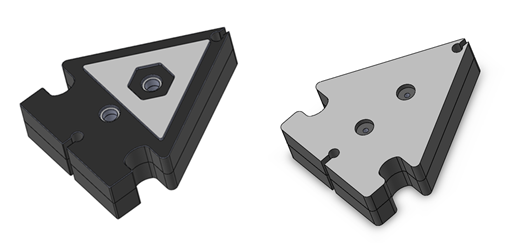
Recently I had to design an earphone holder that would be
injection moulded, so I had to come up with several prototypes. I had to then put
them in an analysis tool to see if the prototypes would be able to be injection
moulded successfully, before I made a final mould. The earphone holder to the
left is the first design, and as you can see the details are more complicated
than the one to the right however the right design was chosen as the final
design.
The simpler earphone holder was chosen because the complexity of the first
design made it unable to be injection moulded easily as a lot of issues arose
with sink marks and improper filling. Utilising one of the main Bauhaus
principles which is function over form, all unnecessary details were removed to
simplify the model to make it easier to be injection moulded.
This is an example of the choice I had to make as a designer, sacrifice the
aesthetic look to improve functionality or sacrifice functionality for a more
appealing appearance? But most importantly, which one is the better design? Did
I make the right choice by sacrificing appearance for functionality? This
proves the point that “good design” is completely subjective to each
individual, some people will agree that I made the right choice, and some will
not, there is no clear line to which the better design is.
The relationship between taste and design and the role it plays when designing
an object is an intricate one, as the designer has to make a choice on how to
balance the aesthetic details and the functionality of their product. To make
it even harder, there is no aesthetic detail that will suit every individual as
everyone has different tastes, and it is also incredibly hard to make a product
that everyone will be able to feel comfortable using or understand how to use
as there are many factors such as symbology when it comes to the interface
design, and physical differences such as hand size. Therefore, good design is
extremely subjective to the individual and as a designer one has to identify
their target group and cater their product around that group, in order to
create a “good design” for those individuals.
REFERENCES
Christoforidou, D., Olander, E., Warell, A., Holm, L.S. Good Taste vs Good Design: A Tug of War in the Light of Bling. Retrieved
from https://lms.monash.edu/pluginfile.php/8323619/mod_resource/content/4/Wk%202%20Despina%20Christoforidou%2C%20Good%20Taste%20vs%20Good%20Design%20%281%29.pdf