Massimo Vignelli was graphic and product designer responsible for many iconic designs such as graphics and products for many “Italian and European companies including Olivetti, Penguin Books, Piccolo Teatro, Pirelli, Poltronova, Triennale, the Venice Biennale, and Xerox”[1] however one of his most famous designs was of the New York city train map which has elements which are still being used till today and can be seen even permeating into other cultures, Melbourne’s very own train and tram map can be seen to drawn heavy similarities and inspirations from Vignelli’s maps.
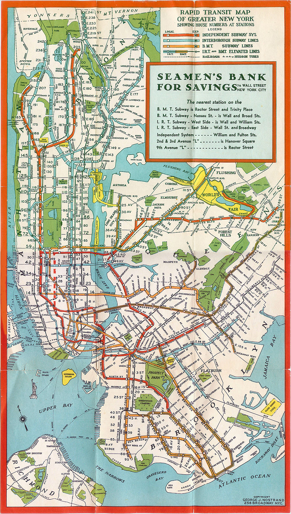
New York city’s old map 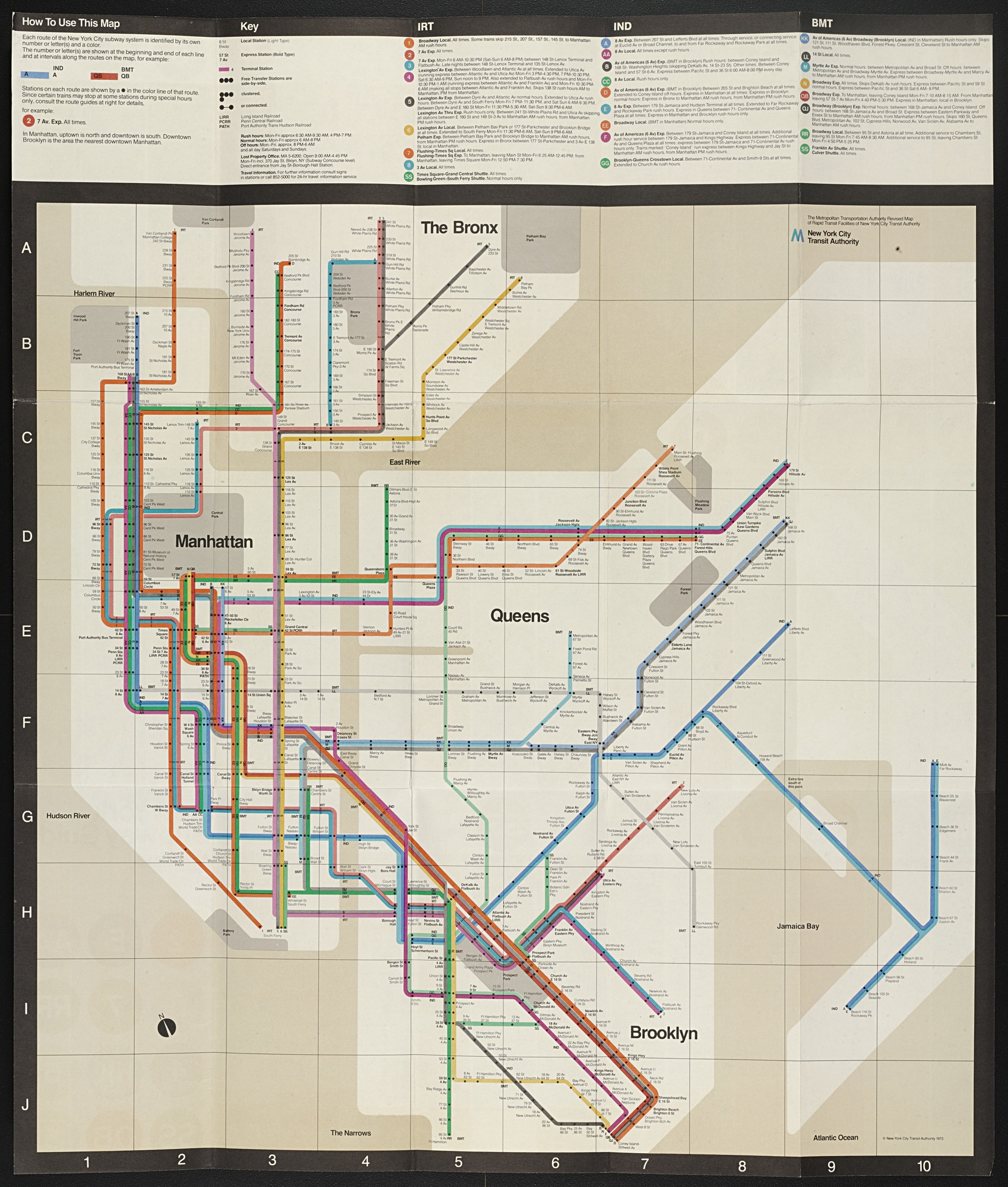
Vigelli’s New York city train map 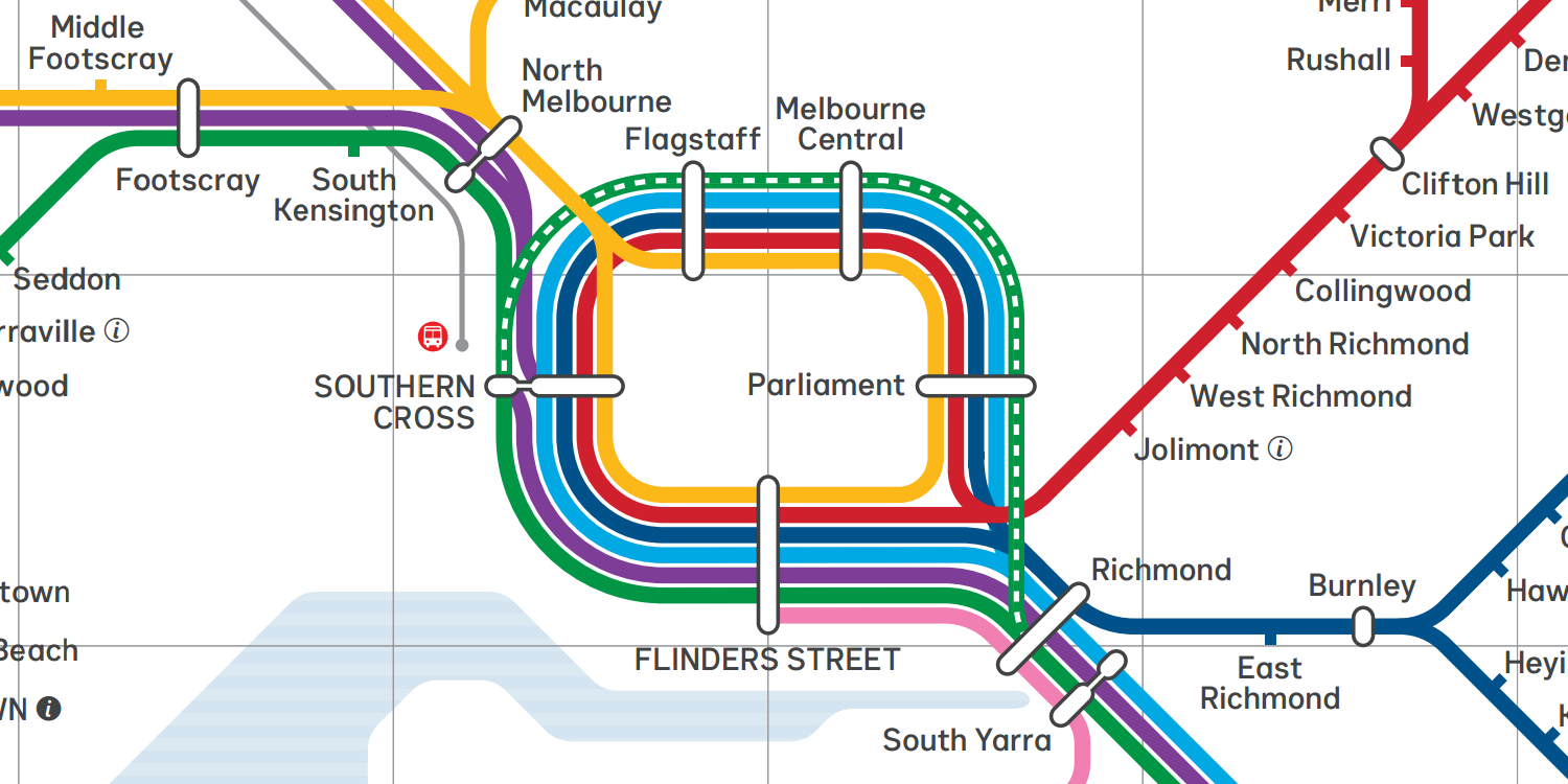
Melbourne’s train map
Vigelli’s design is now iconic among transportation maps, using the minimalist approach to designing the map while still retaining the spacial relativity of land marks and stations, the clean, simple and easy to understand design has allowed for easy planning as positions can be found quickly and effectively.
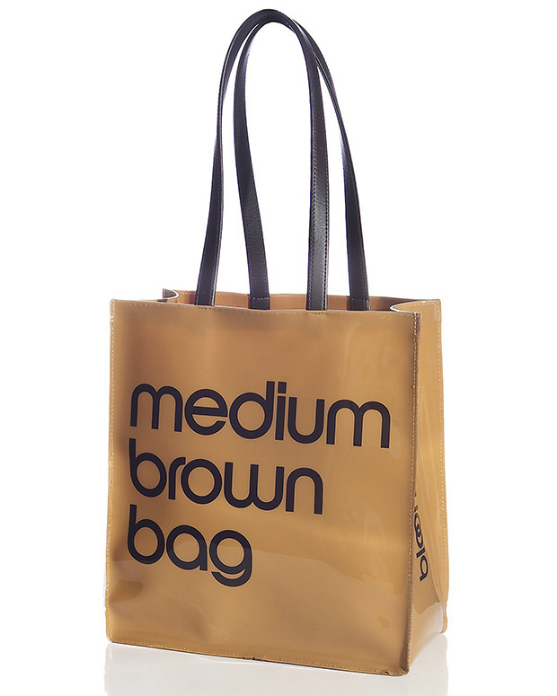
Massimo Vignelli was a firm believer of modernist principals his designs leaning upon the ideas of simplicity and geometric design, which can be seen in many of his works whether they be knives, maps or graphics he was of the leaders in spreading the ideas of mondernist design[2]. He is partially responsible for popularizing simple and clear typefaces, such as Helvetica which we can see being used both in his subway map design and many of his other designs use similar styles of typeface such as the bloomingdales bag which he designed.[3]
Criticism
As a person who introduced modernist elements to maps his designs are not without those who are opposed to them, in fact when the subway map was first introduced it was met with harsh resistance with people struggling with the idea of the slightly wonky geography and gray and tan blocks representing parks and bodies of water. Vignelli obviously refuted those claims ” Of course I know Central Park is rectangular and not square,” Mr. Vignelli said the other day, sitting at a green marble table in his studio on East 67th Street. “Of course I know the park is green, and not gray. Who cares? You want to go from Point A to Point B, period. The only thing you are interested in is the spaghetti.” [4]. However in the end the Metropolitan Transport Authority (MTA) eventually caved to the demands of those against the map and 7 years after it’s release was replaced by a new design by Tauranac which kept the colored lines and dotted stations but returned the lines to their “spaghetti state” which Vignelli comments
“Look what these barbarians have done,” he said as he examined his copy of the current map. “All these curves, all this whispering-in-the-ear of balloons. It’s half-naturalist and half-abstract. It’s a mongrel.”
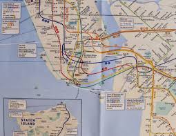
If i were to give my opinion, i would much rather prefer Vigelli’s design over Tauranac partially due to the fact that i am used to melbourne’s transport map, and also i am someone who enjoys the idea of form follows function and like the idea where maps are used to get from point A to B. However i can also see why his proposal was turned down when you look at the two maps and compare them you can see that there is large discrepancies in the placement of land marks, one of the most glaring examples of this is central park which has been squashed into a square not only falsely depicting it but also skewing the distance between landmarks where people who are unfamiliar with the city could be confused by the layout and get misled, this is due the fact that the map relies upon the users knowing the places where they are going meaning that people visiting new areas and tourist could be disorientated by this map.
[1] http://www.designculture.it/interview/massimo-vignelli.html#start
[2] https://www.nytimes.com/2014/05/28/business/massimo-vignelli-a-modernist-graphic-designer-dies-at-83.html
[3] http://www.valcasey.com/webdesign/typ.html
[4] https://www.nytimes.com/2006/09/03/nyregion/thecity/03maps.html?pagewanted=print&_r=0&module=inline