Throughout the history of advertising, the female image has changed along with time. At first, the female image in advertising was humdrum with sexism, such as sexual fantasies or stereotypes of the good wife and good mother. But at present, we can find numerous powerful and independent female images in advertising. The struggle between Nike and its advertising agency Wieden + Kennedy (W+K) is representative this historical narrative.
Nike was known as a masculine sport brand. The parent brand depicted the image of sweating, muscular male athletes. In 1990, Nike executives laughed the women sub-brand. Actually, women’s professional sports were non-existent at that time. The sub-brand opened the door to the huge female market. Almost all advertisements for the Nike Women’s sub-brand were created by the female creative team from W+K between 1990 and 1997. During the early 1990s, the female stance was barely reflected in advertising. To expand the market, Nike executives and the female creative team had totally different ideas about how to achieve this. The team tried to challenge female stereotypes and the social construction of gender through their ads. [1]
In 1990, Nike Women’s first campaign was named List(Figure 1). The creative team started with criticism of women’s magazines. They found that magazines could not represent the actual lives of women. Moreover, members of the creative team were also women who were sick of the message that the magazine conveyed that women exercised for beauty. They believed that women exercise because it makes them feel better. Therefore, they printed a list of what women should refuse. Their audience responded with enthusiasm by hanging the list at home, showing it to their daughters, and buying Nike instead of other brands. [2]
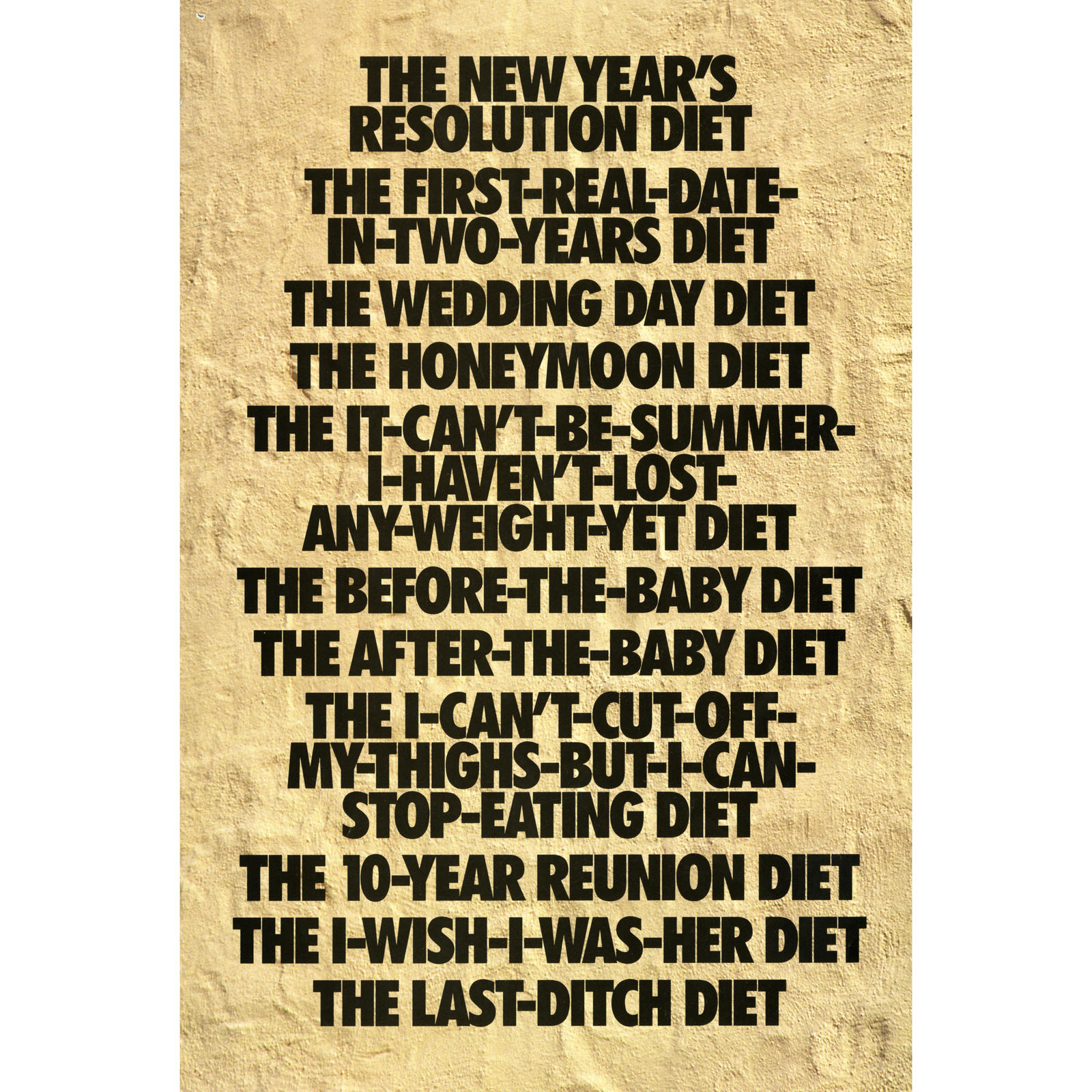
Although sales increased, Nike didn’t acknowledge their efforts. Nike Men got large budgets but Nike Women didn’t. Also, they were restricted to several pages of ad space. Furthermore, Nike executives required that the models in Nike Women’s ads be pretty. Janet Champ, a member of the creative team, wrote a sixteen page ad that was cut to eight pages in the end. This campaign, named Empathy(Figure 2 – Figure 4), described women’s experiences from their childhood to adulthood. The creative team encouraged women to be independent and live for themselves like the sentence in the ad: “never too late to have a life and never too late to change one.” [3]
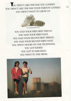
Figure 2 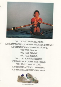
Figure 3 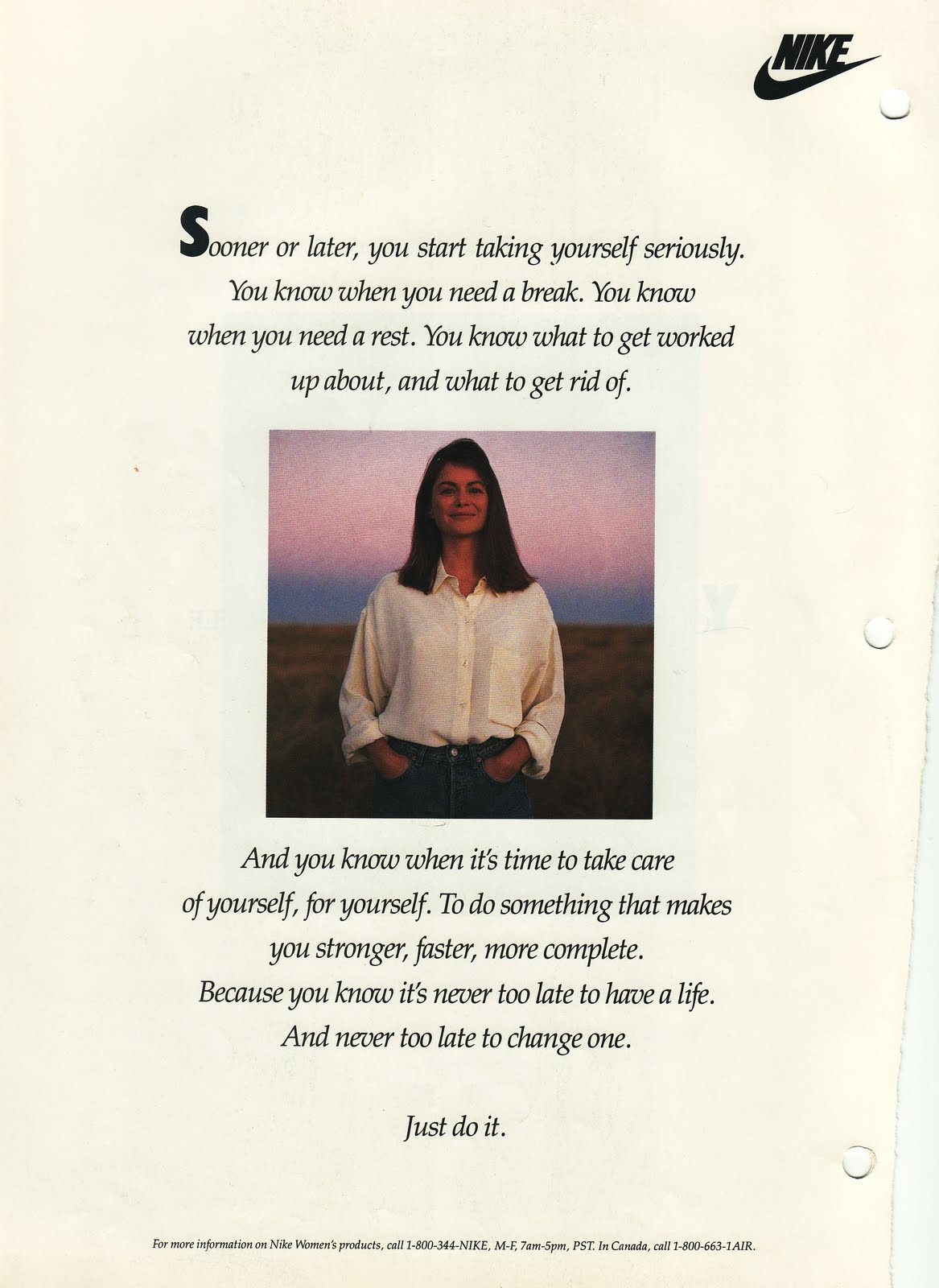
Figure 4
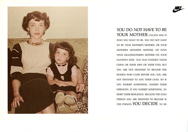
From 1991 to 1992, the Dialogue (Figure 5) campaign was launched. The idea for the ads came from the life experiences of ordinary women like the Listand Empathycampaigns. For this campaign, Champ used an old photograph of her sister and mother. As a woman, when she was growing up, she was expected to be soft and tolerant because of the stereotype of women in society. In this ad, she wrote that “you are not destined to become the women who came before you… the only person you are destined to become is the person you decide to be.” She asked the audience to be the person they want to be and challenge stereotypes of women. [4]
In 1994, at spring, the creative team advised Nike to add sports and not just fitness. But this was hard to realize. The Nike parent brand rejected being “pinkified” by the women’s sub-brand. And those man of Nike executives didn’t believe women can do real sports. Female seems another species for them. In the fall of that year, the campaign shifted from fitness to real sports with Just Do It Stories(Figure 6 – Figure 7). For this campaign, they launched three ads. Two of them told the experiences of two female athletes – Jackie Joyner-Kersee and Mia Hamm. The other one was based on the experiences of two lesbians. The creative team used the lesbian elements to protest against hegemonism. [5]
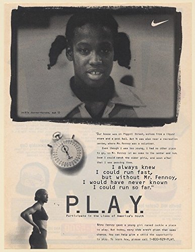
Figure 6 
Figure 7
All of the above campaigns got enthusiastic responses from audience as well as increased sales. The creative team create a sense of empathy with the audience and remind them of past experience. Like the female creative team at W+K, I created a poster as a voice for women (Figure 8). It started from a situation in China where women over 30 years old are often pressured to marry. Those women are called “leftover ladies” or “leftover women.” In Chinese society, most people think an unmarried woman is incomplete and that a woman should be a good wife and good mother. Therefore, once a woman becomes a leftover lady, the people around her, such as her parents, grandparents, and colleagues, desire to see her get married. In the poster, I used only black and white to form a strong contrast. The black square implies the pressure from people and society. The fist represents the power of these leftover women. The women break away from that pressure of getting married so that they can make the decision for themselves of whether to get married or not, decide who they are, and what is meaningful. Same as what the creative team for Nike Women did, the idea of the poster came from the life experiences of ordinary women to create a sense of empathy with the audience. The tagline, “Decide for yourself,” encourages leftover ladies to be independent. All the work by W+K and me are to provide a voice for women and empower women to be confident, independent, and to live for themselves. Moreover, we both question the social structure and protest against the stereotypes of women as well as the patriarchal oppression of women in society.
At the beginning of this story, Nike executives restricted the Nike Women’s creative team to a small budget, pretty models, fitness, and soft female image. Through the struggles of the team, they used ordinary women as models, and started to focus on real sports, showing portrayals of powerful and strong female athletes. Pierre Bourdie conceived a term, “symbolic violence,” to refer to cultural expulsions that might be imperceptible forms of class distinctions. [6] Symbolic violence reflects various aspects in the design industry. One of them is the stereotype that women should be pretty, soft, emotional, and are expected to be good wives or mothers in advertising. Fortunately, there are many designers like the creative team at W+K, who speak for victims, question conventions, and protest against the patriarchal society through their designs.
[1]Grow, Jean M. 2010. The Gender of Branding: Early Nike Women’s Advertising as a Feminist Antenarrative.
[2] Ibid
[3] Ibid
[4] Ibid
[5] Ibid
[6] Onafuwa, Dimeji. 2018. Allies and Decoloniality: A Review of the Intersectional Perspectives on Design, Politics, and Power Symposium.