Nation Gallery of Victoria has held a stunning exhibition at this summer 2018/19. The spark indeed is ignited by Dutch graphic artist M.C Escher and world renown Japanese design studio Nendo. The exhibition features more than 160 exceptional drawings lithographic prints and woodcut printmaking pieces by Escher [1], based on his ideology, Nendo created an enveloping installations and projection mapping. It is the exhibition of collaborating both artist and designer in a first-rate and enigmatic visual experience.
The exhibition is separated into 6 parts according to 6 types of theme that Escher intrigued. Relatively Nendo created 6 projects according to Escher’s skill of creativity, observation of the world, fascination of reflections, enigmatic patterns or structures and the infinity from visual aspect.
《Day and night》(1937)(Figure 1) was one of his most well-known piece which he printed over 650 copies.[1] At first glance of this master piece, it depicts a group of white wild goose and a group of black wild goose are flying in reversed direction over a countryside town. Looking though the structure of this work, the town is absolute symmetrical but in reversed colour of black and white. The right-hand side of picture seems like night time of the town, the left-hand side is at its day time. Start from the centre of this landscape, the white wild gooses flying from day time gradually merging into the night time sky, versa the black flock merging into the day time. Looking through this piece vertically, both black and white birds gradually transiting into ground square farmland meanwhile tessellating with each other. Form visual perspective, it is composited by very neat complex elements, the transition from day and night, landscape to sky and shifting from flying birds to fixed landscape. Escher developed extremely precise details with every object which is definitely impressive.
Intertwining between the design world and artist’s mind, Nendo indeed adopts the ideology from Escher’s perspective of tessellation of art by simply just using black and white to present conspicuous of contrast to create environmental illusion. The Transforming house (Figure 2) project seeks Escher’s constant research in to the ‘regular division of the plane’[2]. In this project by grasping Escher’s mind of graphic architect, Nendo created a house establishment shows up as a three-dimensional decoration in which a line of four dark houses steadily changes into a column of five white houses. The four front house roof step by step open up and out, as though turned back to front, until the spaces outside to the houses at the ones in the front have turned out to be inside spaces at the back. They made the project a wonder tessellated installation in a mathematical way, the principle of angles of the roof brings a sense of journey as the viewers passing through.
Throughout the whole exhibition, NGV has provided not only visual art display experience but also combined with all aspect of the sensors that we human capable of. From aural perspective, it started with gentle slow music speaking the story of Escher’s early life, as the viewers going forward the music starts getting more euphoria and intensive. Nendo’s project were placed in between Escher’s work regarding to his life journey and evolution of his perception to optical art. According to Adam Mack has mentioned in his article The politics of Good Taste, supermarket chain designer have been attempting to climax “the sensory pleasure of grocery shopping” [3] since 1950s, the principle of giving a pleasant experience to the audience can also apply to this exhibition but in order to interpret the engagement between the artist and designer. By selling this luxury visual experience, NGV has make their viewers feel themselves as having a ‘good taste’ [4] in art to attract more people willing to pay for the entry of this exhibition.
National Gallery of Victoria had made Escher X nendo undoubtedly one of the most blockbuster exhibitions this year. Not as those big names in the art world, Escher was relatively infame in the mass especially contemporary society, however, NGV made the invitation to nendo which shares the same interest with Escher in paradox tessellation and optical illusion, upholds the same spirit of craftsmanship, has brought the attraction to the audience by its terrific aesthetic and sensory experience whilst integrating tremendous influence of social media nowadays.
Figure.1
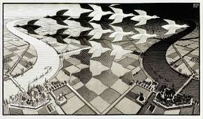
《Day and night》
Figure.2
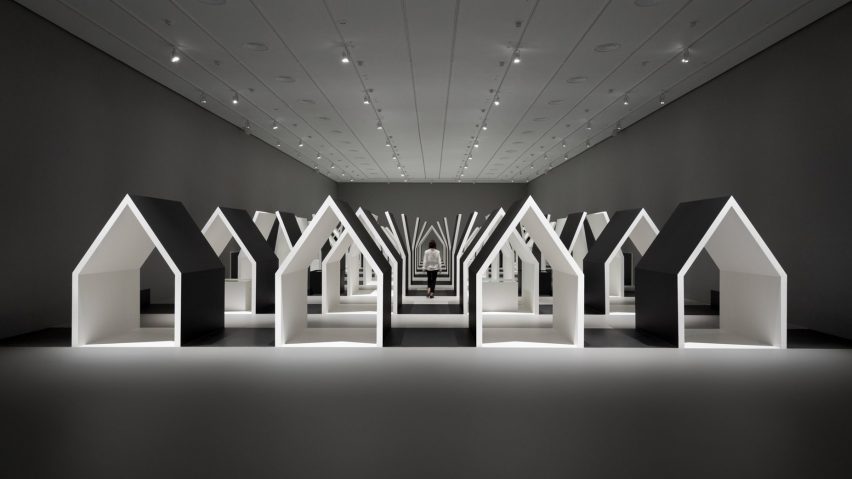
《The transforming house》
[1][2]National Victoria of Gallery, https://www.ngv.vic.gov.au/exhibition/escher-x-nendo-between-two-worlds/.
[3] [4] Adam Mack, The
politics of good taste.


