The Slight Leap From Art To Design

In the Journal article, Transformation of the Aesthetic: Art as Participatory Design, by Matthew Holt, Holt asserts that there has been a long standing connection between art and design, and that it is a bridge so short that many artists jump from one side to the other with little effort. There have also been writers such as Alex Coles that have discussed this closeness in detail. Coles coined the term ‘designart’ to describe this grey area between the two fields.[1]

While most of Holt’s article focuses on participatory projects acting as a bridge between art and design, I would argue that this is not the only necessary bridge. Certainly from a design perspective travelling in the direction of an art perspective, collaborative design is a huge step towards the art side of things.

However what about approaching this idea from an artists perspective, where a piece is not necessarily created with an audience in mind at all, unlike design, it has the luxury of being almost entirely introspective if the artist so chooses. I have often indulged in selfishly ignoring what a customer may or may not purchase or relate to, in order to express my own ideas, something that if applied to design, would result in a failed creation.

But on the other side, as I have learned design, I have also learned to create a distance between myself and my work where the audience sits, and where they too have a say. This mixture of selfish and selfless creation can be jarring, but is there a middle ground between the two, aside from participatory design? Something both personal and accessible to an audience?

Callum Guy Douglas, The Dusk-trader’, 2017

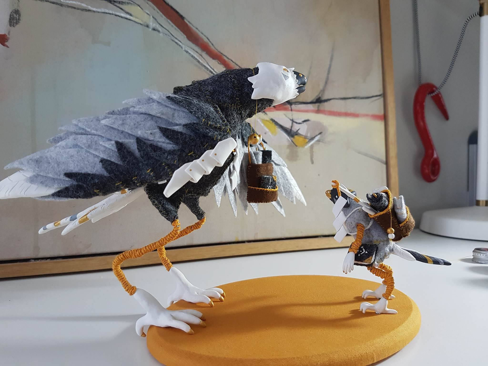
This is a sculptural work I created in 2017 called ‘The Dusk-trader’ which at the time, I would have considered a completely self indulgent piece. However upon closer thought, years later, and with a bit of design understanding, I can see that several aspects of the work could be seen as edging toward design.

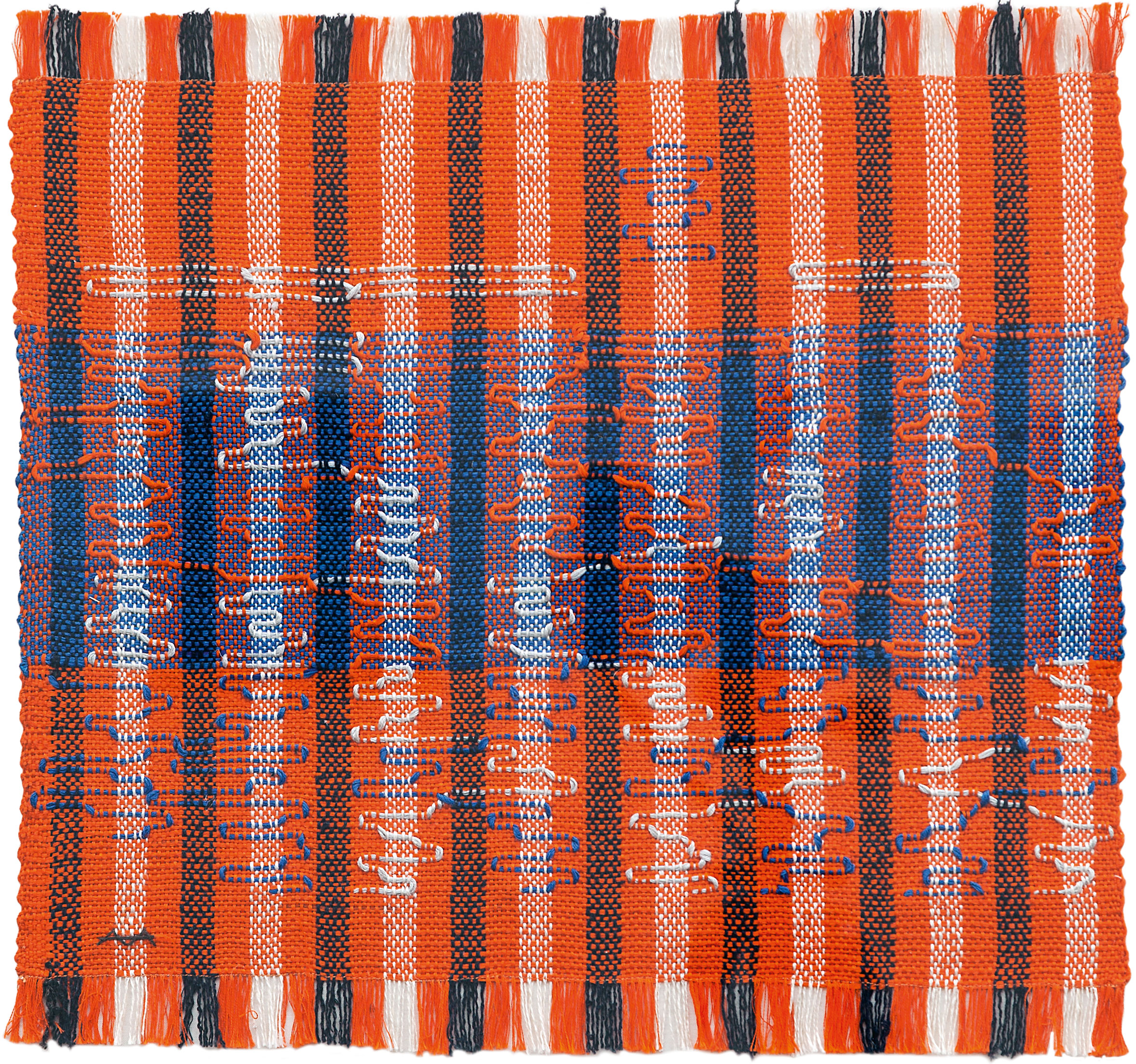
Something both art and design can’t escape sharing is use of colour to create emotional responses to work. I have always stuck to a limited palette, with equal distribution across all elements. And even when creating a piece of design work, unless specified by a brief, the use of colour is always something I do for myself. Unless absolutely necessary I wont budge on my colour choices.

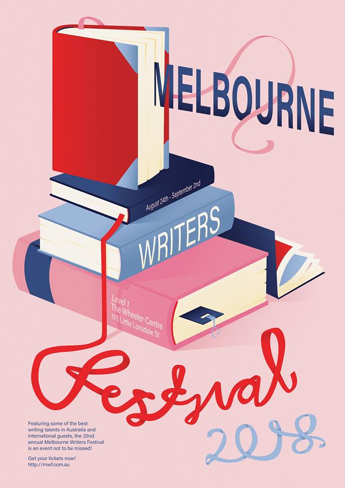
The similarities in colour distribution can be seen in this work created last year to promote the Melbourne Writers Festival. The colour, in both works, is what is used to lead the eye around the piece. The choice of colours in both circumstances were based on design ideas, in that all of the colours chosen harmonise together, and the limited palette allows for easier distribution. The colours however, are not representative of anything in particular, but where selected based simply on my feelings at the time. This is both selfish and selfless at the same time and perhaps a small way in which design and art can come together in pieces.

An artist/designer that shows how the two disciplines can be hard to separate at all is Paula Scher. She claims that ‘Typography is painting with words, that’s my biggest high.'[2] This statement shows a personal emotional reward related to the practice of design, which would otherwise usually be associated with art. Paula has been shifting between the worlds of art and design for many years, and some of her work is hard to describe as either in particular.

‘I could never walk into an office, and sit down at my desk to design’ Paula explains her method involves a move introspective experience when creating a design to solve a problem, which also reflects ways in which both and artist and designer would tackle the creative process, both selfish and selfless at the same time. It is both involving herself, and using that to solve a problem for someone else.


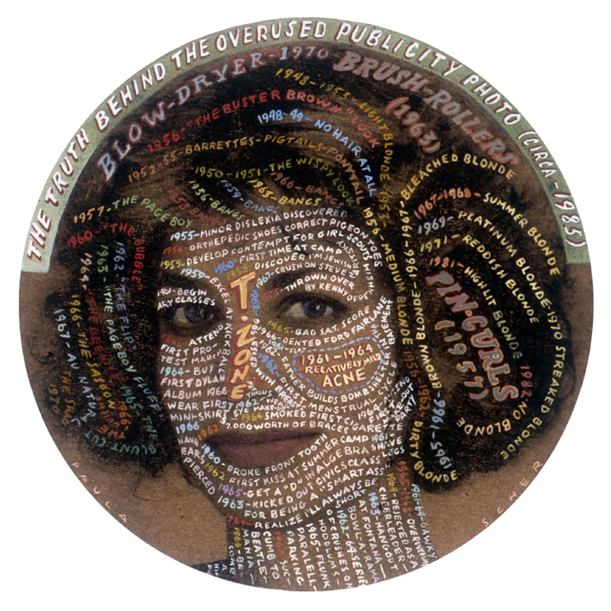
Self-portrait of Paula Scher created for the AIGA, 1992 [3]

In this work Paula combines her love of typography, a traditionally design based skill, and transfers or elevates it into the world of art by using it as a visual link between an image and a memory. This personal injection into the work is part of why it would be viewed as art rather than design, however using the same skills, ideas of colour theory and composition, Paula creates works that are more closely viewed as design outcomes.

Pocket books featuring Paula Scher’s Maps [4]

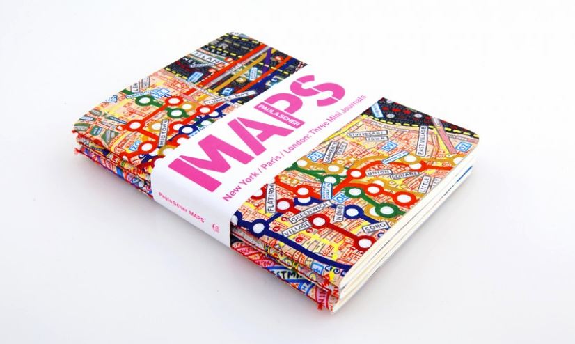
Paula has a create love for organising information, and that can be seen in her map illustrations. They are both beautiful and also serve the purpose of a map, if slightly hard to read. However, to me these seem as close a meeting of the worlds of design and art as can be as they are both completely self indulgent at the same time as being entirely useful for a purpose.

When compared to my own work, it can be seen that my pieces are still more rooted in either art or design, whilst Paula’s demonstrate a closer meeting in the centre, without necessarily succumbing to the participatory design described by Matthew Holt in his article.

[1] Matthew Holt, ‘Transformation of the Aesthetic: Art as Participatory Design’, 2015

[2] Paula Scher, Abstract, The Art of Design: S1 E6, Netflix

[3] Image accessed on 06/04/2019 from https://www.pinterest.com.au/pin/655344183253220064/

[4] Image accessed on 06/04/2019 from
https://www.designindaba.com/articles/creative-work/pocket-map

Callum Douglas – 28830644 – topic 2: Contextualise your own design practice

Why Was Anni Albers Less Celebrated Than Her Male Bauhaus Counterparts?


The Bauhaus School was created with the idea of combining arts and craft, design and architecture into an eventual single field and is often credited with having a huge impact on modernism across many disciplines.

But among those studying and teaching at the Bauhaus, certain people are more commonly accredited than others, despite the certain works and their impacts on the standards of commonly practised design, the female creators of such works have often been overshadowed by the works created by the equally talented, yet male, designers at Bauhaus.

Anni Albers joined Bauhaus in 1922 along with future husband Josef Albers. Anni, who had previously trained as a painter under Martin Brandenburg, has said that she began doubting her skills when male artist Oskar Kokoschka bluntly asked her “Why do you paint?”.

Anni sought to learn glasswork and painting at the Bauhaus, but was declined, as Bauhaus prohibited women from attending most of their workshops at the time. Josef Albers however, quickly became recognised as a master within his own practice.[1] Anni was instead forced to enter the Weaving workshop, which was viewed as a feminine skill. But Anni embraced her position as a weaver and began creating works that impressed many at the Bauhaus, eventually earning her the position of head of the weaving studio in 1931, making her one of the first female designers to hold a position of power at the school.

Anni’s work whilst at the Bauhaus was not only challenging to the Bauhaus status quo, but it challenged many ideas that connected weaving to a craft rather than art or design.

Anni is quoted as saying “to let threads…find a form themselves to no other end than their own orchestration, not to be sat on, walked on, only to be looked at.”[2]

She was implying that just because weaving was traditionally used as a means to create practical or decorative household ephemera, the combination of threads could ascend into something more.

Intersecting by Anni Albers, 1962 [3]

This idea can be seen perhaps most strongly in her work ‘Intersecting’ from 1962, long after the Bauhaus was forced to close by the Nazi Regime. The work’s impact is in its use of colour, form, texture and movement. It is also jarring to see a work of weaving that was produced not with the idea of symmetry in mind, but rather, breaking that tradition form with a flowing sinuous line that is leading the eye all over the piece. It is also interesting to note the use of weaving own medium to break itself, rather than introducing a new element, Albers has used thread as the method by which to break the understanding of what a woven textile should be, or appear to be.

And yet this piece retains its usability. It would fit into many modern homes as a rug or wall hanging, but also as a respectable piece of art that questions itself.

It is interesting to think that Albers was barred from pursuing a male oriented design workshop due to the rules of the establishment, and yet she has created work that weaves lines between many areas of design using this weaving workshop as her foundation. This is perhaps one of the most successful examples of Bauhaus’s original raison d’etre, adding painterly qualities into textiles and giving them a new realm to exist within. Albers has been quoted as saying that originally she thought weaving was ‘Sissy’. Perhaps the ideas of the time in regard to gender roles were so ingrained that even the women of Bauhaus shied away from things traditionally seen as women’s work because of the power and importance associated with male dominated fields like architecture. But Albers has proven that power can be associated to any field, and any field can be changed and manipulated regardless of gender association.

While Bauhaus began as a ‘boys club’, it eventually was beginning to recognise its own female talent, unfortunately this was cut short by the Nazi Regime in 1933, and the strides that female artists within the Bauhaus hierarchy were making were cut short. Perhaps if the Bauhaus had remained open, it may have been able to develop into an establishment that could have lead the way for similar institutions of the time in establishing a female presence in the design world of modernism. The skills of many female artists within Bauhaus has forced the male staff to take notice.

For instance Marianne Brandt, in recognition of her talent, was given a space in the metalwork workshop, which was a workshop strictly reserved for men, and in 1928 she even rose to become the head of the department.[4]

Unfortunately the design field has been strewn with similar incidents of gender identity impacting the distribution of work and while no longer forbidden, there is still a skewed instance of female students studying traditionally male design area.

fig.1

The article ‘Women Designers Is There A Gender Trap?’ by Margaret Bruce and Jenny Lewis aims to understand this trend, even 50 years after the closing of the Bauhaus. It can be seen from the above graph from this article that female students are not studying areas like Industrial design, whereas areas like graphic design have a fairly even distribution.[5]

Bruce explains that perhaps this can be boiled down to female students being faced with the idea that women should not be doing certain things. Not just from men but also women who have grown up believing certain ideas about gender, the pressure of fighting against those forces from every angle is just too great and it is easier to shy away from something that people will actively try to dissuade you from pursuing.

It is noted also in the article that the design fields seen as traditionally female disciplines should not be disparaged or seen as less important, but re-evaluated. This ties in perfectly with the way Anni Albers tackled the art of Weaving, not just as an area of work designated for women, but as a way to break boundaries and elevate the benign.

[1] accessed on 05/04/2019, https://albersfoundation.org/artists/biographies/

[2] Dominic Lutyens, ‘Anni Albers And The Forgotten Women Of The Bauhaus’, 2018, accessed on 05/04/2019, http://www.bbc.com/culture/story/20180919-anni-albers-and-the-forgotten-women-of-the-bauhaus

[3] Image accessed on 05/04, https://www.tabletmag.com/wp-content/uploads/2018/12/Anni-Albers-Intersecting-1962.-X64702.jpg

[4] Lou Stoppard, ‘Why the fearless women of the Bauhaus are the forgotten trailblazers of art history’, Jan 2019, https://www.sleek-mag.com/article/bauhaus-women/

[5] Margaret Bruce, Jenny Lewis, ‘Women designers is there a gender trap?’, April 1990

fig.1, Screenshot from ‘Women designers is there a gender trap?’

Callum Douglas – 28830644 – topic 3: forgotten superheroes of design