From Bark to Neon
The From Bark to Neon exhibition which is held at the NGV in federation square is an exhibition showcasing old style aboriginal art as well as new style neon inspired artwork. The exhibition that consists of 4 main rooms rooms as well as corridors lined with intricate and colourful artwork, each telling their own story brings the spaces to life. The exhibition was one in which I had never experienced before as in the past I have usually had no interest in Aboriginal art, going into the exhibition I was looking to change that and gain some insight into the type of art. Containing new pieces as well as some older pieces the exhibition was bustling with people in every room, surprising seeing as it had been around for around 8 months prior to me visiting. The exhibition had an extremely systematic flow which was enjoyable as it really showcased the progression of the type of art that was shown as well as progression away from traditional forms into more abstract means.
The exhibition consisted of many different methods and media and this variety was exciting to the eye. The way that the exhibition flowed from start to end, from the original applications of aboriginal art such as paint on canvas to a print on clear acrylic moving onto neon sculptures, the exhibition really expresses the meaning of its name ‘From Bark to Neon’. One thing that was exciting about the art to me was the sheer amount of colours and how it bought the walls to life showcasing intricate skill and shows the care that the artist has put into every stroke on every piece. As the exhibition became more abstract the art still showed a large amount of care and planing to what may be seen by some as careless or rushed strokes. Regardless the talent and thought that was put into every piece was truly admirable.
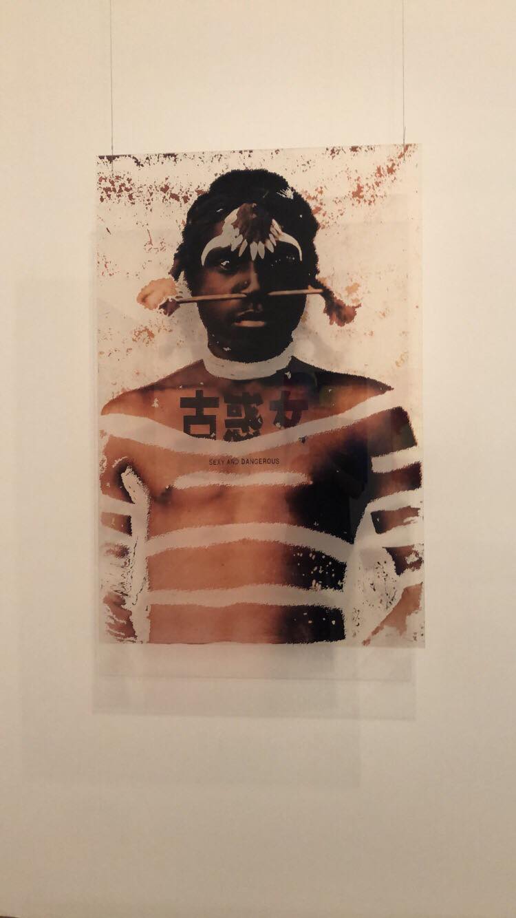
There was many exciting and interesting pieces that grabbed attention, ranging from painting to sculpture. The eye was being drawn to many interesting and exciting pieces however there was one that stood out to me, this piece being a photo on a piece of clear acrylic called “Sexy and Dangerous” [1] which was produced by Brook Andrew, a photo taken in 1996 by Charles Kerry and produced into this piece of art in 2005. I really enjoyed the mix of showing the aboriginal person portraying a ‘sexy and dangerous’ image in an attempt to replicate a billboard campaign. Although the subject that is being advertised is unclear it is more about portraying an image that the photographer portrayed at the time. The application method of print on clear acrylic really allows for the image to somewhat pop off the wall and show the image of the tattooed man with the spear through his nose. The graphic having no background other than some artistic colour allows for no confusion around the subject of the picture besides the man with the ‘sexy and dangerous’ tattoo across his chest. In my opinion this piece was the best one there not only because of the imagery used but as well as the application it was presented.
Although the name suggests the evolution of aboriginal art from ‘Bark to Neon’ it is evident that this is only a metaphor for the progression and direction as well as the evolution that aboriginal artwork has taken, and where it will be going in the future. With limited ‘neon’ pieces in the exhibition the neon aspect of the name was overturned by sculpture which really allowed the audience to view the progression of the art form. As well as that the use of digital media in pictures and the use of vibrant colours that transitioned away from the expected pallets of the more older aboriginal artwork were truly showing the direction that the artists are going in. Transitioning away from traditional media however still letting their aboriginal heritage and influence show through predominantly in every piece, creating an identity for each piece that is extremely clear. It truly is an amazing style of art that allows not only story telling but artist expression as well as education on the past and present people in the aboriginal community.
Upon visiting the exhibition I truly gained an understanding and appreciation for Aboriginal artwork and really enjoyed and am excited for the progression that its making. I highly recommend visiting the exhibition to anyone else who wants to further their knowledge about aboriginal art as well as anybody who already has an interest in this style of art. Not only was it an art exhibition it was also an education about the native people of the land and through this art it was a chance for them to convey their story. It is important that this art continues on for years to come to ensure the history of Aboriginal Australians is solidified.
[1] Sexy and Dangerous, Brook Andrew 2005, From Bark to Neon (NGV) Visited 1/4/19